

Section 01
THE FLOW CODE

Vol.21 | The Shortcut Codes
The physics of moving air, computed for free. Then printed like it deserves a wall.
CFD stands for computational fluid dynamics, the software engineers run to watch air and water move around an object before they build the real thing. The code hands you that entire visual language in four words: streamlines, velocity color maps, pressure zones, turbulent wakes. Type it with any subject and you get a competent engineering render every single time. That is exactly the problem. Everyone gets the same one. This page runs the bare code on six subjects so you see the default ceiling, then rebuilds each one until it looks like a plate from a field institute with impeccable taste. The code brings the physics. You bring the design.
What The Code Actually Is
Honest framing first. "CFD simulation of" is not magic. It points the model at a real archive: aerospace papers, wind tunnel renders, simulation software screenshots, engineering marketing decks. That archive is why the code works. It hands you real flow behavior for free, boundary layers, vortex pairs, wake structure, and it usually gets the physics story roughly right.
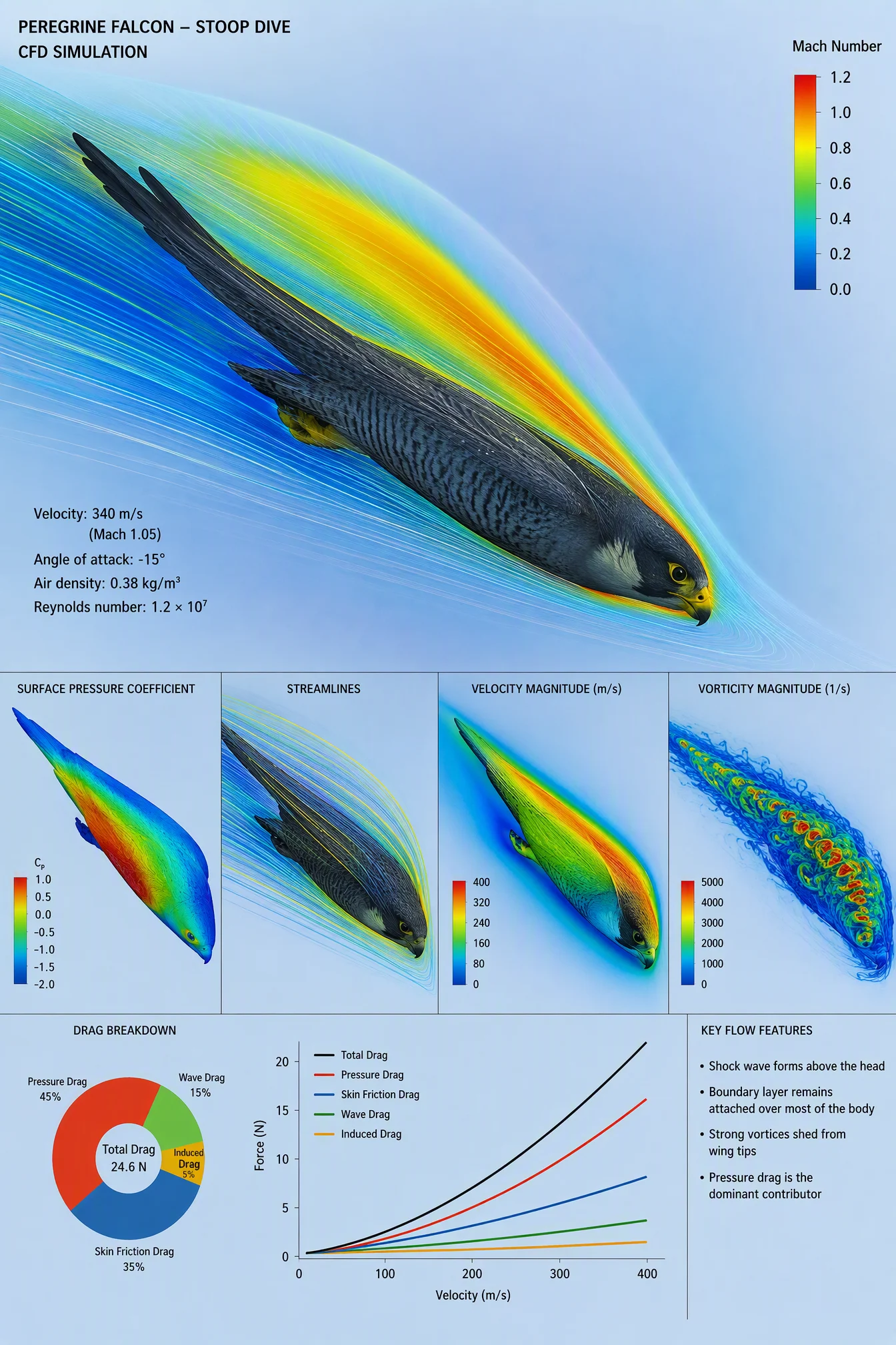
Now the ceiling, exactly as it showed up in this production run. The default has four tells. First, the rainbow. Simulation software ships with a red-to-blue jet colormap, so the default drowns every subject in the same rainbow gradient, and it did on all six. Second, the dead object. The subject renders as a gray polygon mesh or a software model, because in real CFD nobody cares what the object looks like. Third, no design. Software-slide layouts, side panels, labels wherever they land, sometimes the prompt itself pasted across the top as a heading. Fourth, and this one surprises people, the default fabricates. One bare render gave a falcon a supersonic 340 m/s dive speed with a straight face, and another printed a real ball brand on the golf ball without being asked. The information layer is present. The design layer and the discipline layer are absent. That gap is this entire page.
The Control Layer
This vault set runs under one named movement: Field Physics. Invisible forces documented like specimens by a field institute with impeccable taste. Paper stocks instead of screens, patient hairlines, one disciplined ramp of color where the physics lives, and nothing glows unless the physics glows. Every block below serves that movement.
STYLE THE CODE protects what the code already does well. You name the streamlines, the velocity mapping, the pressure zones, and you tell the model to keep them. Without this clause the design language you add starts erasing the simulation truth, and you lose the reason the code works.
THE ART DIRECTION is the new block, and it is where the design level lives. Three named decisions: one design tradition the model holds a real prior for (a naturalist engraving plate, a two-ink risograph, a Swiss poster grid), one composition device (hero at scale, the measured margin, horizon discipline), and one quiet quote, a small embedded detail that rewards a second look, a plate number, a specimen tag, a registration cross. Adjectives like premium and clean produce the average of everything. A named tradition produces a point of view.
PALETTE LOCK kills the rainbow, and after this vault it also kills the default ground. Pure white and pure black are banned. Every poster names its ground like a printer choosing stock: duck-egg blue, oatmeal, warm charcoal-brown, chart cream, terracotta, dusty rose. Then one ink color derived from the ground, one velocity ramp carrying all flow color, and the closing line "no other colors introduced." The closing line held on every render in this vault. It works.
THE OBJECT is this category’s hero block. The default renders the subject as a mesh. The move is to demand the subject as a real, photoreal object, real dimpled urethane, real feathers, real sailcloth, while the air around it stays graphic. That contrast, a real hero inside a drawn world, is the signature of the whole category.
THE DATA CARRY keeps the numbers honest. Every figure must be a real fact the model already knows, unchanged, with a callout cap so the poster breathes, and when a specific anchor matters, you pin it yourself: at 250 km/h. This block is the defense against the fabrication tell above.
TYPE SYSTEM names the title and subtitle in full, pairs two typefaces by genre, allows three sizes only, and puts section headers in wide-tracked small caps. Small caps headers are the cheapest editorial upgrade in the system.
LABEL DISCIPLINE is the quiet professional layer. Hairline leader lines in one weight, small terminal dots, labels living in the margins and pointing inward, never printed across the subject.
FINISH names a print process instead of a screen look, offset with faint ink bleed, silkscreen flatness, risograph grain, then the ratio, chosen per subject before writing and set in the generation settings to match, plain and controlled always at the same ratio.
Prompt 1: The Golf Ball Manual, 3:2
Default:

Controlled:

What to notice. The bare code shipped a navy software slide with a full rainbow, the prompt pasted across the top as a title, and a real ball brand printed on the ball. Nobody asked for the brand. The archive for this subject is so saturated with one manufacturer that it even survived the first controlled render, which is why the prompt bans printed text on the ball outright. Then the design pass moved the ground from paper white to duck-egg blue and everything changed register: dotted-leader spec lists, a plate number, margins that behave like a manual page. Same physics, same ball, different century of design. The figures came back real all the way down, 42.67 mm, 45.93 g, 336 dimples, and the ramp legend maxes at the actual local airspeed, not a decorative number.
Swap ideas. A tennis ball with topspin. A baseball and its seam wake. A knuckleball float. A badminton shuttlecock, the fastest projectile in racket sport.
Prompt 2: The Falcon Plate, 2:3
Default:
Controlled:
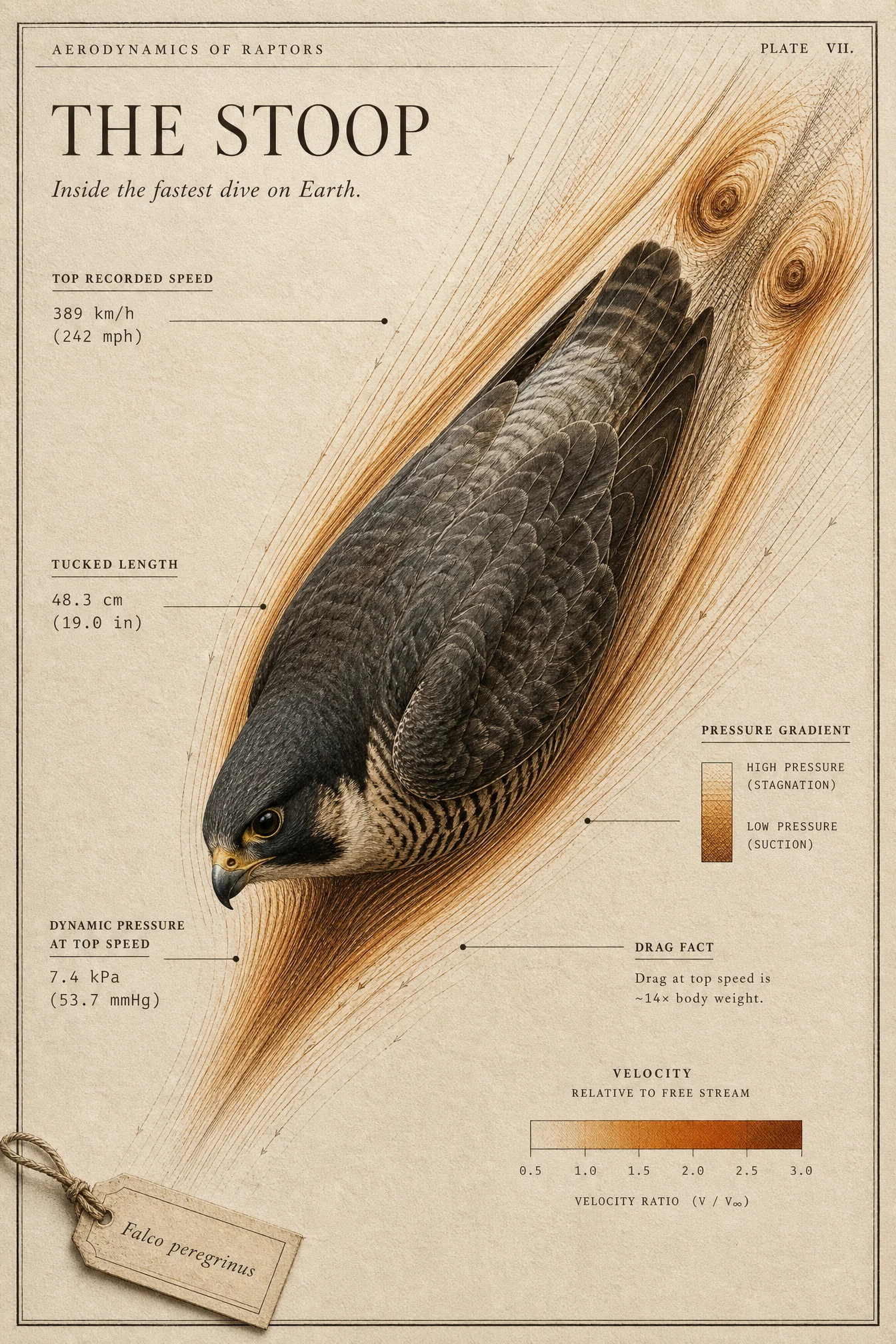
What to notice. The bare render is the reason THE DATA CARRY exists: it printed a 340 m/s falcon at Mach 1.05, supersonic nonsense dressed in chart clothing. The controlled version snapped to the real record, 389 km/h with a correct 242 mph conversion, and the dynamic pressure label even checks out against the physics. The design pass is where this one earns a wall: the bird photoreal against a crosshatched sky of drawn air, and the quiet quote came back better than written, the model rendered the Falco peregrinus tag as an actual paper tag tied on with twine. One honest caution: a derived label claimed a drag figure of many times body weight, which overshoots what physics allows at terminal speed. Headline figures come back real. Derived multiples deserve a ten-second sanity check before you publish.
Swap ideas. An albatross in dynamic soaring. A flying fish mid-glide. A kingfisher entering water. A swift in a screaming descent.
Prompt 3: The Risograph Race Car, 16:9, the deliberate dark one
Default:

Controlled:
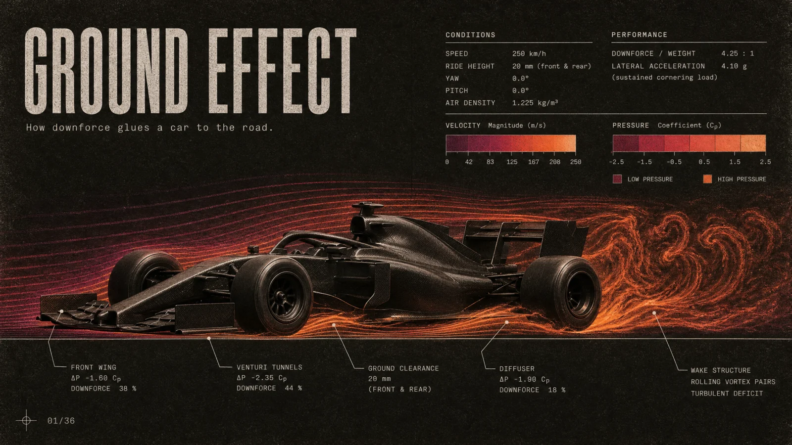
What to notice. This subject has the strongest default of the six, because motorsport CFD renders saturate the archive, which makes it the best proof that a picture is not a poster: the bare version is decent and still has two competing rainbow ramps, zero typography, no story. Production taught two lessons here. First, the archive leaks brands: the first controlled render printed a real tire brand on the sidewalls, so the prompt demands completely blank rubber by name. Second, anchors inflate: an unpinned run attached a genuine downforce ratio to a heroic 450 km/h. Pin the anchor inside THE DATA CARRY, at 250 km/h, and the keeper came back exactly there, with a 4.25 to 1 ratio, a 4.1 g cornering load, and component downforce percentages that sum to one hundred. Dark remains a choice, not a default: this is the set’s one deep sheet, and the prompt states its reason in the palette block itself.
Swap ideas. A superbike with a tucked rider. A time-trial cyclist. A four-man bobsled. A high-speed train nose in a crosswind.
Prompt 4: The Yacht On Its Chart, 21:9
Default:

Controlled:

What to notice. This slot originally belonged to a container ship, and the vault audit killed it: the container ship is a Vol.20 Blueprint subject, and the replacement candidate, a submarine, turned out to be a Vol.19 Cutaway subject. The code treats subjects as interchangeable variables. Your vault must not, because your members own those other pages. The yacht keeps the water physics and brings a better story, the keel turning sideways push into forward drive. The bare render is a photo composite drowning in rainbow ribbons with four software panels stacked down one side. The controlled version hangs everything from the horizon datum, splits the world at the waterline, cream above, drawn teal water below, and the hull speed callout carries the real formula, 1.34 times the square root of waterline length. It also demonstrates the callout cap doing its job: exactly seven, numbered, and the poster breathes.
Swap ideas. A sprint kayak at full power. A rowing eight at race pace. A windsurfer on a broad reach. A river barge convoy pushing upstream.
Prompt 5: The Terracotta Tower, 9:16
Default:
Controlled:
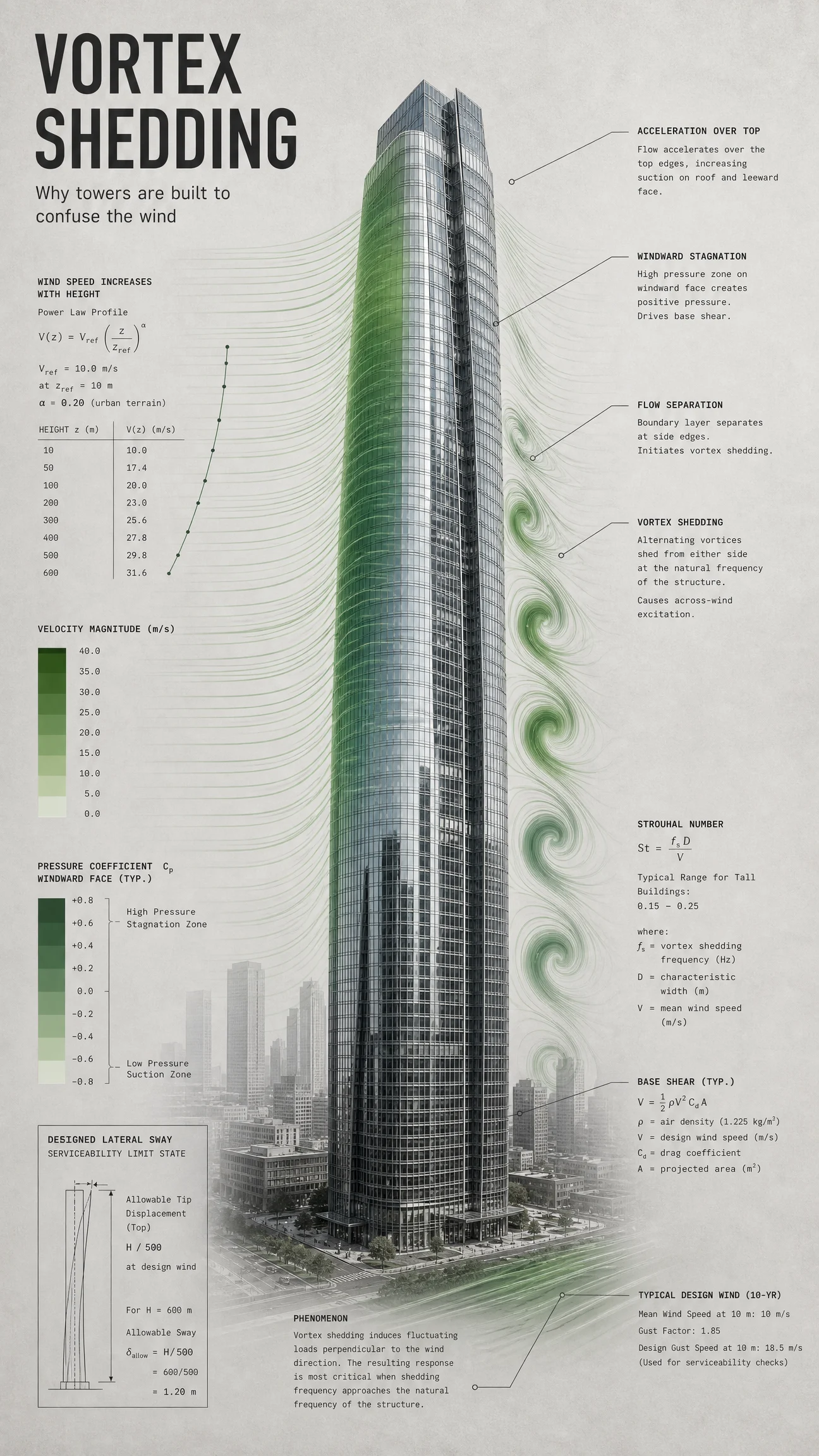
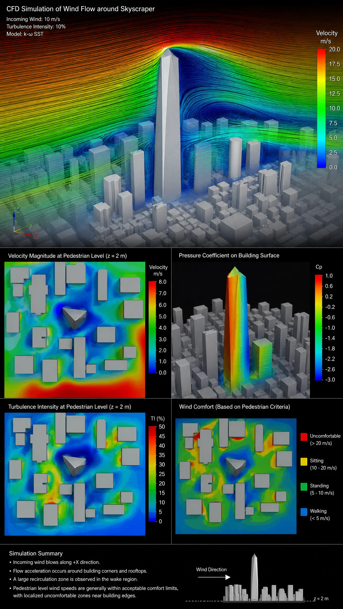
What to notice. The default came back as a four-panel wind engineering report on black, pedestrian comfort maps and all, impressive and completely unusable as a wall piece. The design pass asked for terracotta and the model answered poetically: warm parchment sky above, baked terracotta earth below, the tower rising between them with petrol-blue vortices peeling down its leeward side. When a ground gets interpreted as a world instead of a flat sheet, accept it when it serves the poster, and restate "the entire sheet is one ground color" only when it must not. The Swiss column on the left holds the data with small caps and rules, the sway allowance is the real serviceability class of figure, and the whole thing reads like it was pinned up at an architecture school in 1968. One prior-run caution stays on record: an earlier take drifted its wind profile table from its own stated exponent while looking perfectly professional. Tables lie beautifully. Check one row by hand.
Swap ideas. A stadium roof in a storm. A wind farm and its wake chain. A street canyon funneling a gale. A radio mast singing in the wind.
Prompt 6: The Civic Cloud, 4:3
Default:
Controlled:
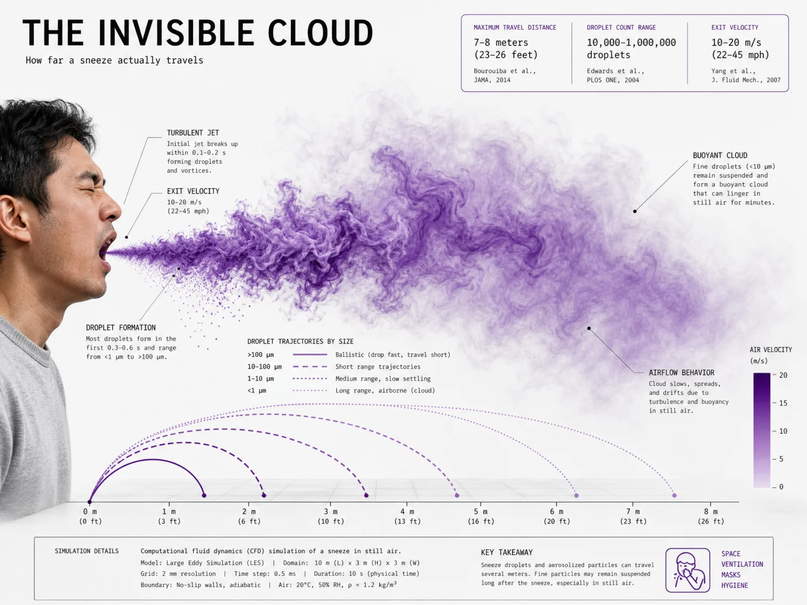
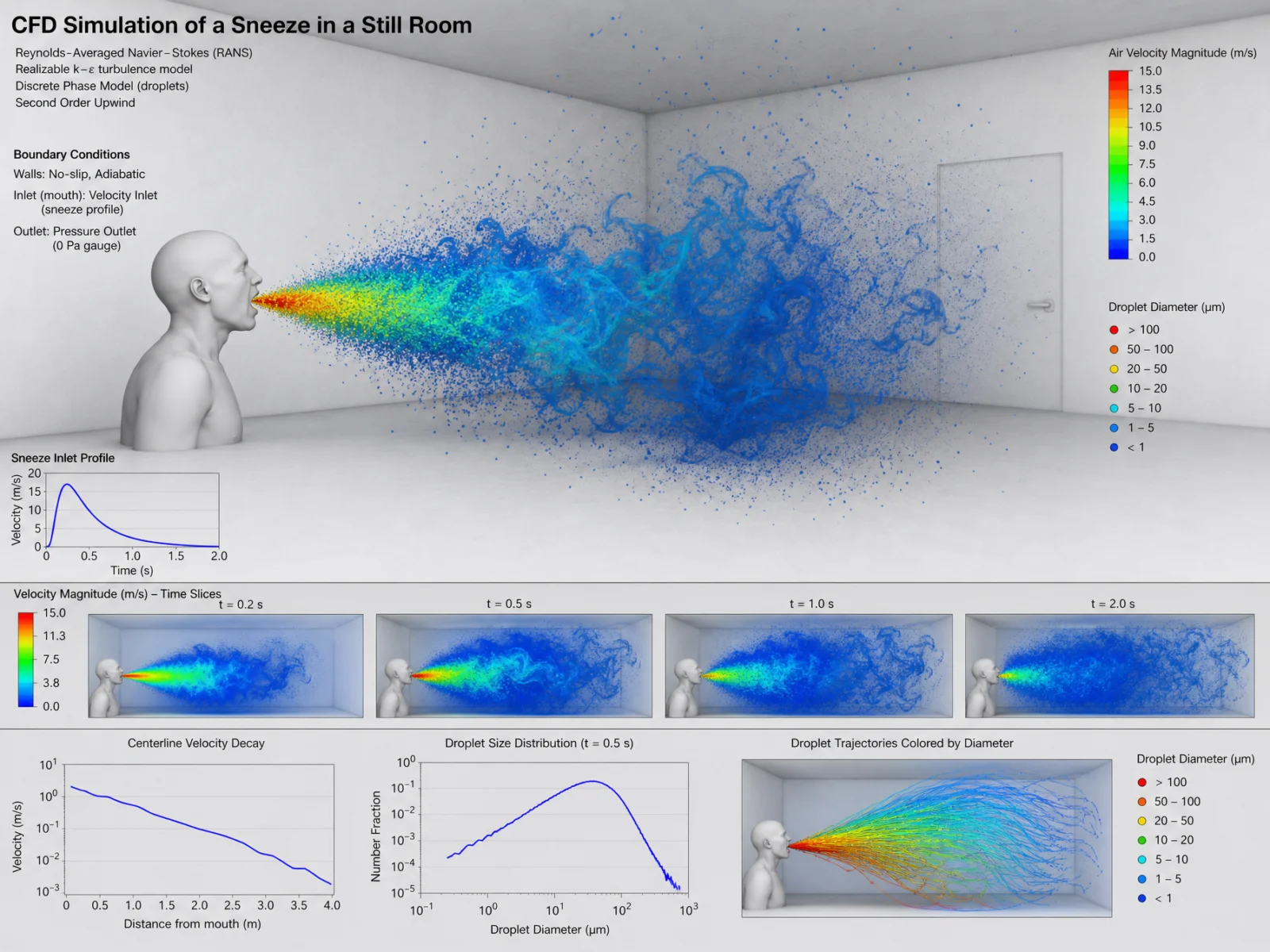
What to notice. The default rendered a gray mannequin bust in a white room, correct physics, dead image. The human story dies with the mannequin and THE OBJECT block brings it back. This prompt also carries the vault’s most useful scar. The subject has one definitive famous study behind it, so the first design take was allowed a source box, and the model produced the real researcher with a misspelled word and a slightly wrong citation inside an otherwise perfect poster. That cost the retry. The rule that came out of it is written into the prompt above: ban the source box, the footnote line and author names outright, and demand correct spelling. The keeper is clean end to end, the conversions all check out, 22 to 40 m/s really is 49 to 89 mph, and the Isotype legend renders the droplet classes as rows of counted symbols along the measured floor. Civic information, not a lab slide.
Swap ideas. A cough at a bus stop. Breath on a freezing morning. A hair dryer’s hot jet. A ceiling fan stirring a bedroom.
The Method In One Box
Run the bare code first, always. Six subjects, one identical default, that is the whole argument for this page in a single test.
Keep the code as line 1 of the controlled prompt. It is the information engine, and it never gets edited.
Name the movement before you write the set. Six posters under one named aesthetic read as an album, not a playlist.
Choose the ground first, like a printer choosing stock, and never pure white or pure black. Plan all six grounds before prompt one: this set runs duck-egg, oatmeal, charcoal-brown, chart cream, terracotta, dusty rose.
One named tradition per poster, rotated across the set, never repeated back to back. One composition device, stated by name. One quiet quote.
Real hero, drawn world. The object is photoreal and unbranded, the flow stays graphic.
Real figures only, capped in number, and when the anchor matters, pin it yourself: at 250 km/h.
Two typefaces, three sizes, small caps section headers, and every label lives in a margin with a hairline leader and a terminal dot.
Close with a print process, not a screen look, then the ratio. Set the same ratio in the generation settings, medium quality at 2K is the production standard.
One retry per image, only when the checklist fails, and fix the single cause.
Common Issues And Fixes
These are the actual failures from this vault’s production run, with the fixes that cleared them.
Real brands appear without being asked. A ball manufacturer printed on the golf ball, tire lettering on the race car sidewalls. When a subject’s photo archive is dominated by a few brands, the default reaches for them. Fix: ban printed text on the object inside THE OBJECT, and name the exact surface it leaks onto, the ball’s surface, the tire sidewalls.
Source boxes are where trouble lives. One take credited a real record to an invented researcher. Another cited the real famous study with a misspelled word and the wrong volume. Fix: no sources box, no citations, no footnote lines, no author names, and if a subject truly owns one famous study, read the box before publishing.
Anchors inflate. An unpinned run attached a real downforce ratio to a heroic 450 km/h. Ratios come back real, anchors come back cinematic. Fix: pin the anchor inside THE DATA CARRY, anchored at 250 km/h, and the model complies exactly.
Titles gain words and digits corrupt. One subtitle grew an extra word, and two dense labels rendered garbled characters. Fix: introduce the subtitle with reads exactly, forbid changes, and demand every printed word and number cleanly legible.
Plausible tables drift from their own math. One wind profile table disagreed with its own stated exponent while looking perfectly professional. Fix: there is no prompt for arithmetic, check one row by hand before publishing anything data-led.
Derived figures overshoot. Headline facts come back real, but derived multiples can exceed what physics allows. Fix: sanity-check any label that multiplies, it takes ten seconds.
The ground becomes a world. Ask for terracotta and you may get a terracotta landscape instead of a flat sheet. Accept it when it serves the poster. When it must not happen, write "the entire sheet is one ground color."
Subjects collide with your own catalog. The code treats subjects as interchangeable. Your vault must not: this category’s water subject was swapped twice in the audit because the container ship belongs to Vol.20 and the submarine to Vol.19. Keep a list of every subject you have ever shipped, and check it before you generate.
Errors that can happen even on a clean run, with the fixes pre-loaded.
The rainbow creeps back on long prompts. As a prompt grows, the palette lock can lose the fight with the code’s default colormap. Fix: keep "no other colors introduced" as the last line of its block, and if a stray hue survives, name the offender in the retry, no green anywhere on the sheet.
The hero comes back illustrated. A strong art direction can pull the object into the drawing style, a crosshatched falcon instead of a photographed one. Fix: THE OBJECT already says photoreal and never a mesh; if it still flips, add "the subject looks like a photograph placed onto the drawn sheet."
The flow buries the subject. Streamlines render across the hero’s face or body instead of around it. Fix: add "streamlines pass behind and around the subject, never across its face" to STYLE THE CODE.
Software chrome appears. The code’s archive is full of screenshots, so toolbars, panels or a fake interface can frame the image. Fix: add "no software interface, no panels, no toolbars, no watermark" to STYLE THE CODE.
Ratio mismatch. The prompt names one ratio, the settings hold another, and the model letterboxes or stretches the layout. Fix: the ratio lives in two places by law, the FINISH line and the generation settings, and they must always match before you press generate.
Type sizes multiply on data-heavy subjects. A fourth and fifth text size sneak in when the subject offers too many facts. Fix: restate three sizes only and cut the callout cap by one, the poster gets calmer and stronger.
Next Step
Run the golf ball pair first, default then controlled, and study the gap between the two images before touching the other five. Swap subjects freely, the blocks do not change, and keep your own shipped-subject list beside you when you do. When your set holds together, post your favorite before and after in the community. Page 2 brings a new mechanic: THE SCALE CODE, true-to-scale lineups against one measured datum, where the shared ruler is the story.
Section 02
THE SCALE CODE
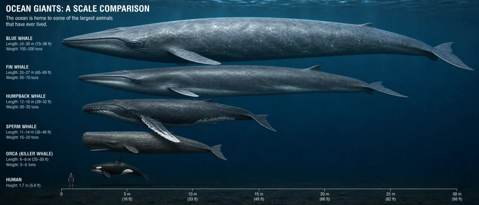
A size chart, done for free. Then measured like it means it.
The internet loves comparing sizes, and the model has seen every viral version of it: whales against buses, towers against towers, dinosaurs against people. That is why "scale comparison of" works with any topic you can name. It also has a specific set of diseases, and this category exists to cure them: collages that pretend to be charts, hedged ranges on every label, and names that drift away from their numbers the moment you restyle anything. The cure is one drawn ruler, one witness everyone knows, real photoreal subjects, and a pinned roster. The code brings the lineup. You bring the honesty.
What The Code Actually Is
"Scale comparison of" points the model at the internet’s favorite educational format: the size chart. Museum wall diagrams, encyclopedia plates, viral YouTube thumbnails, forum infographics. The archive is enormous, which is why the bare code produces something chart-shaped for any topic on the first try, and why several of its defaults in this vault carried mostly correct figures.
The ceiling has four tells, and this category showed all of them in production. One, the collage: the default loves photo strips with a separate human in every panel instead of one shared ruler, which quietly kills the entire point of a scale comparison. Two, the hedge: every label becomes a range, 24 to 30 meters, 12 to 13 meters, because ranges are safer than confidence. Three, the scramble: push the style anywhere interesting and the names drift off their numbers, real figures attached to the wrong subjects. Four, this category’s special hazard: historical machines come back wearing their historical insignia, and one of this vault’s defaults was unshippable for exactly that reason. The information instinct is strong. The discipline is absent. That gap is this page.
The Control Layer
This set runs under one named movement: The Common Ruler. Awe measured against the everyday. One datum rules every sheet, the subjects stand against it like evidence, the ruler stays drawn and the specimens stay real.
STYLE THE CODE protects the true relative sizes and the lined-up comparison logic. The honesty of one shared scale is the entire point, name it and keep it.
THE ART DIRECTION works exactly as it did on Page 1: one named tradition, one composition device, one quiet quote. This set rotates six traditions across six posters: museum wall diagram, mid-century scientific plate, vintage encyclopedia plate, naturalist engraving, Japanese technical manual, Isotype.
PALETTE LOCK holds the ground law: never pure white, never pure black. This set runs midnight navy (the one deep sheet, because the subject is the lightless deep), ochre mustard, sage green, kraft brown, duck-egg blue and bone.
THE DATUM is this category’s own block, and its signature. One measured baseline or scale rules the sheet: a meter ruler under the ocean giants, a vertical scale beside the towers, a stepped tenfold ruler for the microscopic. Every subject stands against it at true relative scale, and one familiar witness, drawn in plain ink, tells the viewer how big everything really is: a diver, a human figure, a jumbo jet, a pencil tip.
THE DATA CARRY carries this category’s hardest-won law: PIN THE ROSTER. Lineups scramble name-number pairs when the roster is left open. Write the full list with its real figures into the prompt, then close with "print each figure once beside its own subject, never swapped, never repeated." Every poster that obeyed this law came back with every figure correct.
THE OBJECT keeps the specimens real: photoreal whale skin, real stone and glass, real doped fabric, real falling water, while everything measured stays drawn.
TYPE SYSTEM, LABEL DISCIPLINE and FINISH hold Page 1’s law unchanged: two typefaces in three sizes with small-caps headers, hairline leaders with terminal dots in the margins, and a named print process instead of a screen look.
Prompt 1: The Museum Wall of Giants, 21:9
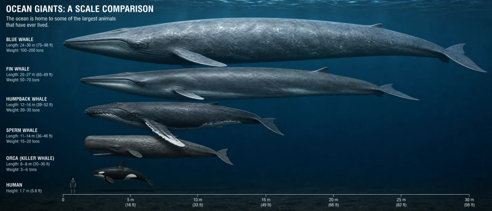
Default:
Controlled:
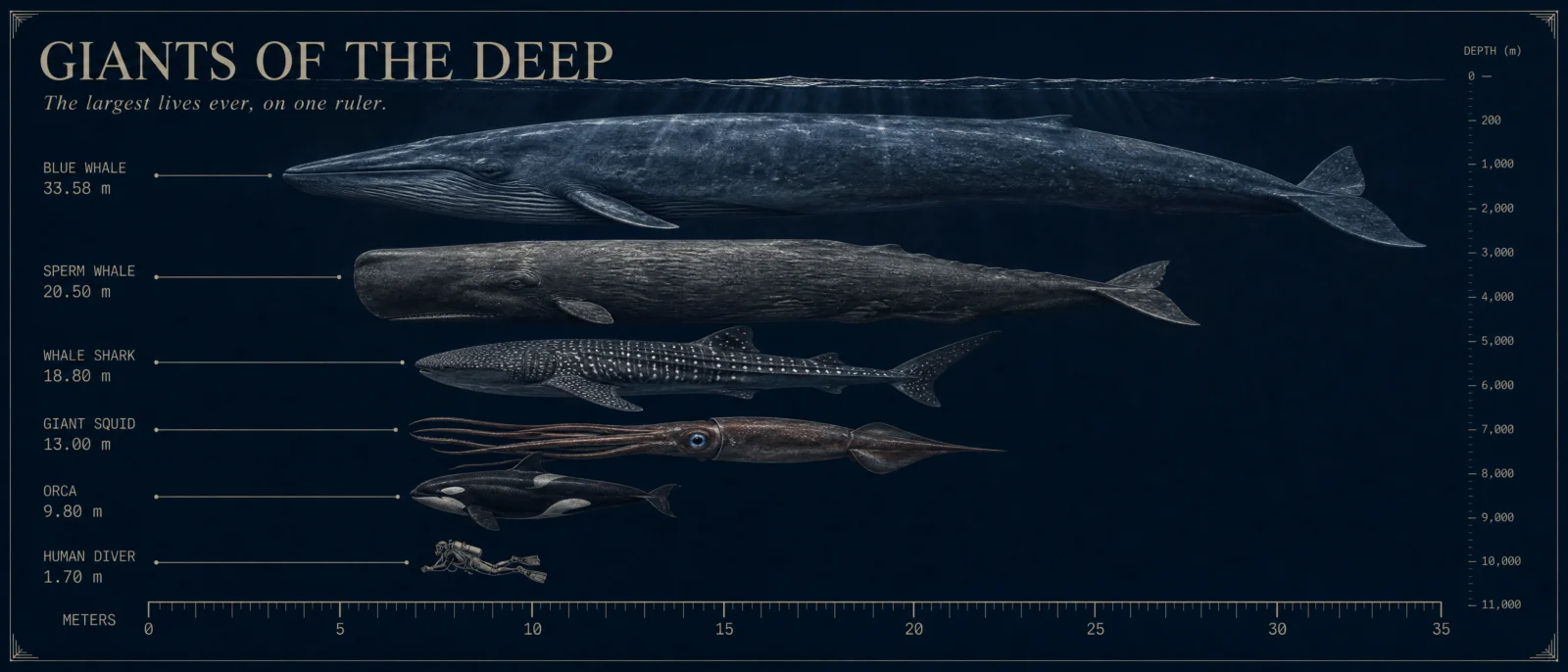
What to notice. The bare code already produces something respectable here, because the size chart is a viral format the model has seen a thousand times, but look closer: hedged ranges on every label, a stock underwater composite, and a sperm whale quietly undersold at 11 to 14 meters. The controlled version came back with every printed figure the actual record book number, 33.58 for the blue whale, 20.5 for the sperm whale, 18.8 for the whale shark, 13 for the squid, 9.8 for the orca, each printed once, with a drawn diver floating beside the smallest giant. The one deep ground of the set earns its darkness: the subject is the lightless deep, and the depth soundings along the margin quietly say so.
Swap ideas. River monsters on one ruler. The great sharks, living and extinct. Deep sea stations against the trench. Icebergs against their hidden mass.
Prompt 2: The Schoolbook Height Race, 9:16
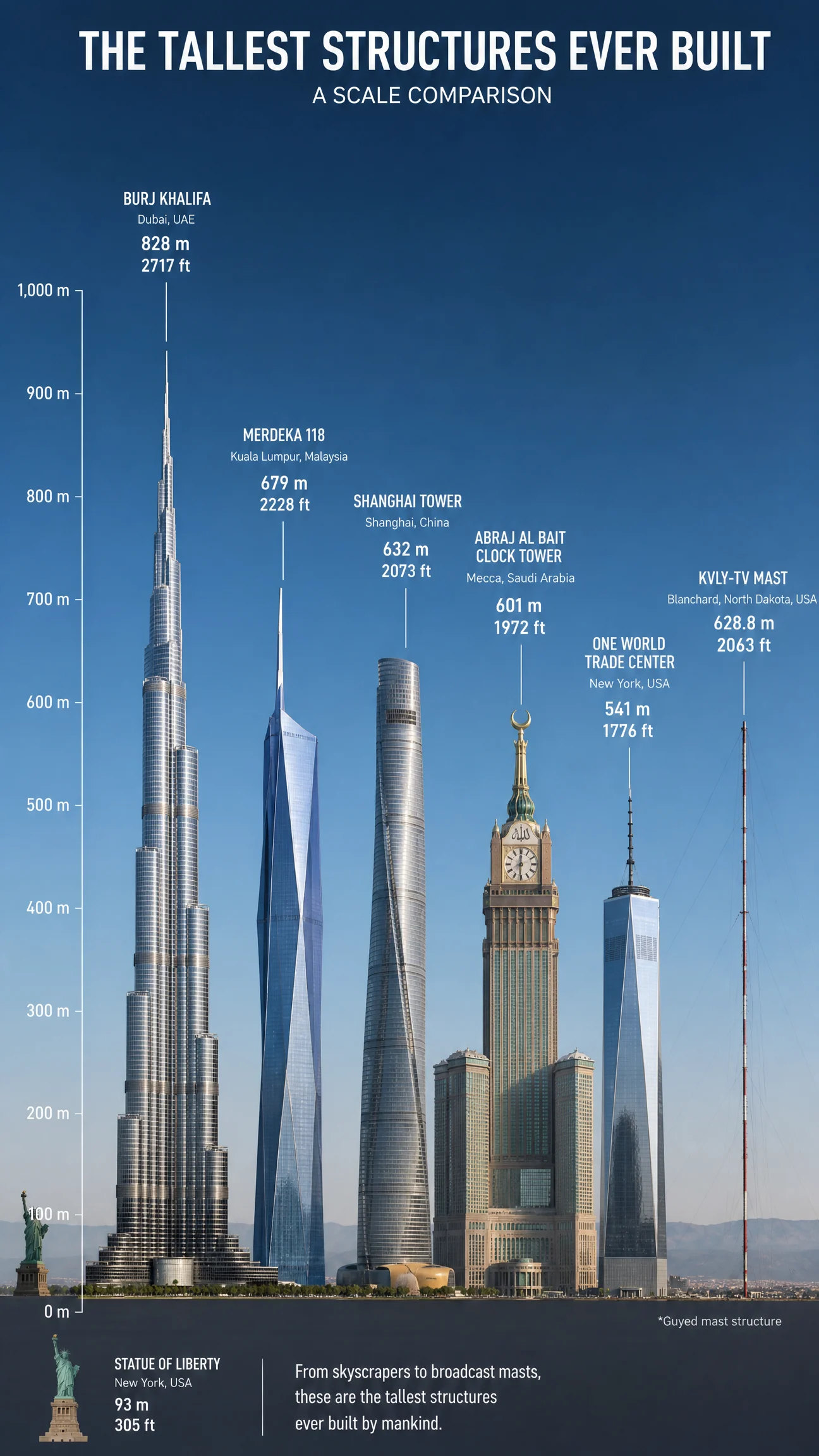
Default:
Controlled:
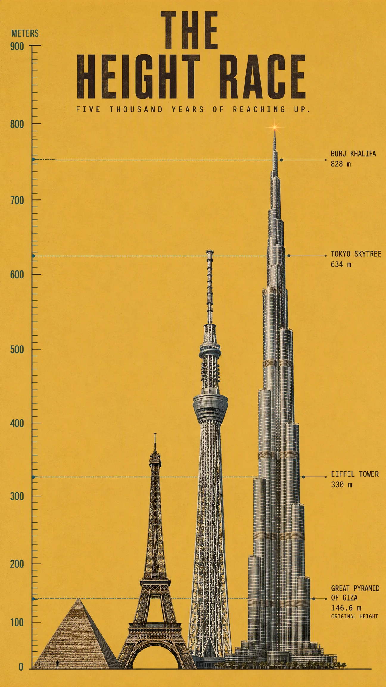
What to notice. This prompt is where the roster pin was born. The bare default got almost every height right, Burj 828, Merdeka 679, Shanghai Tower 632, because the tallest-structure chart is deep in the archive. The first controlled attempt restyled hard, and the knowledge shook loose: the CN Tower’s exact 553.3 came back printed under Tokyo Skytree, and the pyramid’s height appeared twice under different names. Real figures, wrong owners, the most dangerous kind of wrong. The pinned retry came back perfect: four structures, four correct heights, each printed once. One honest limit stays visible: the drawn Burj reaches about 790 on the drawn scale, not 828. Printed truth first, drawn truth second, and the page teaches both.
Swap ideas. The tallest statues ever raised. Bridges by their main span. The deepest mines against the tallest towers, one scale. Rockets on the pad through history.
Prompt 3: The Unmarked Fleet, 16:9
Default:
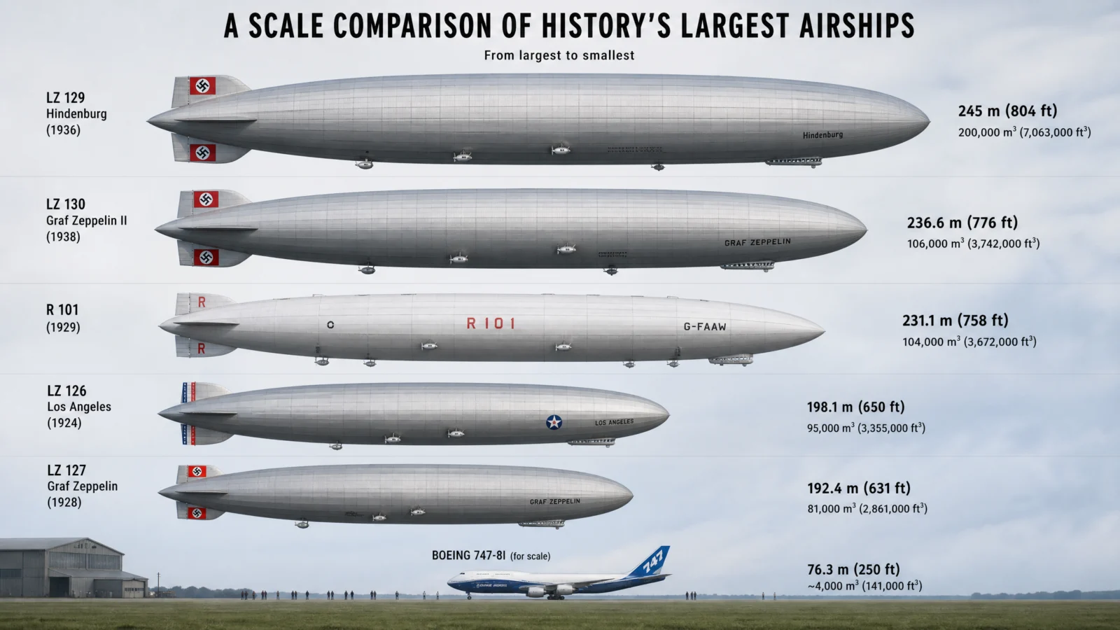
shown with one safety clause added, see the note below
Controlled:
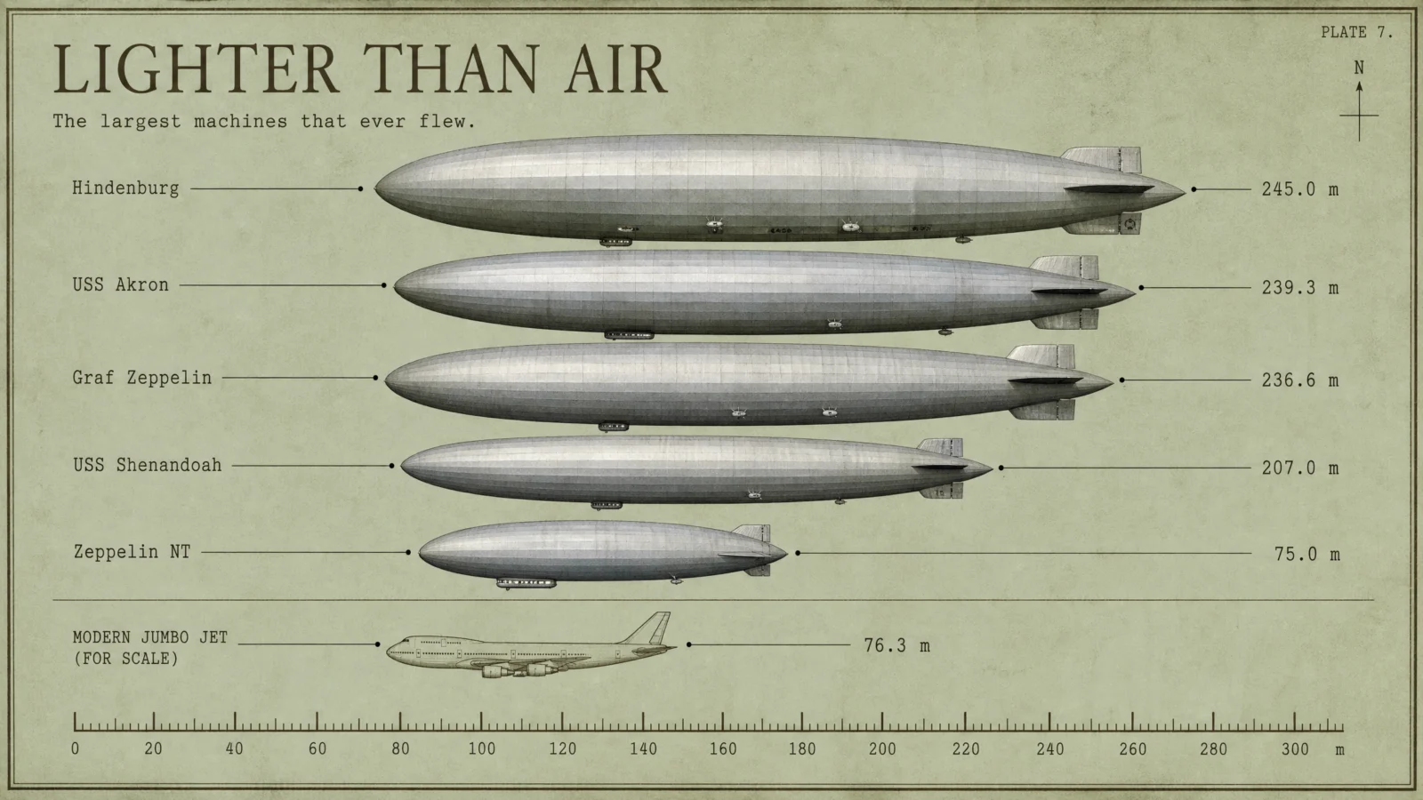
What to notice. This is the vault’s most important safety lesson, so read it once and keep it. The pure bare code was run twice, and both times it dressed the great zeppelins in their period insignia, swastikas on the tail fins, drawn with a straight face because that is what the archive holds. Neither take can ship in a family-safe product, both live in the rejects folder, and the default you see above is the bare code plus a single safety clause: no flags, no insignia, no national markings. That is the one place in this vault where the bare code itself needed a guard before it could even be shown. The first controlled attempt also scrambled its facts, wrong lengths, wrong navy designations, and a flying boat smuggled into an airship lineup. The pinned, unmarked retry came back exact on all five lengths with clean hulls. History’s machines carry history’s symbols. Ban them by name, pin the fleet, and check the names before you publish.
Swap ideas. The great ocean liners, bow to stern. History’s largest wooden ships. Cargo planes nose to tail. The largest things ever moved by road.
Prompt 4: The Kraft Paper Hunters, 4:3
Default:
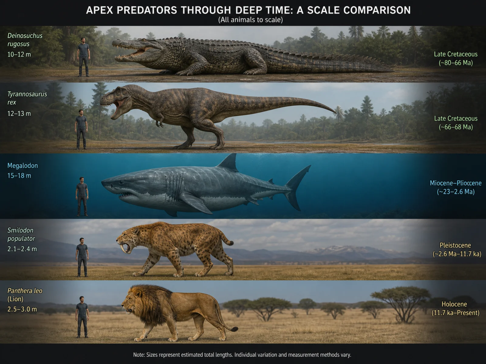
Controlled:

What to notice. The first controlled take is the cleanest demonstration in the vault of an anchor swallowing a hero: the naturalist engraving tradition is so strong that it pulled every animal into crosshatch, a beautiful poster that broke the category’s signature, real subjects in a drawn world. The fix is written into THE OBJECT above, the animals look like photographs placed onto the drawn engraved sheet, and the retry came back exactly right: real hide and fur against drawn hatching, every pinned figure correct, epochs in small caps under the names. One taught limit: the drawn animals do not always span their stated lengths on the drawn ruler. The printed figures are the contract, the drawing is the art, and your eye checks both.
Swap ideas. The great herbivores against the great hunters. Flying predators through time, on one wingspan ruler. The biggest cats, living and extinct. Ocean hunters by tooth size.
Prompt 5: The Falling Meter, 2:3
Default:
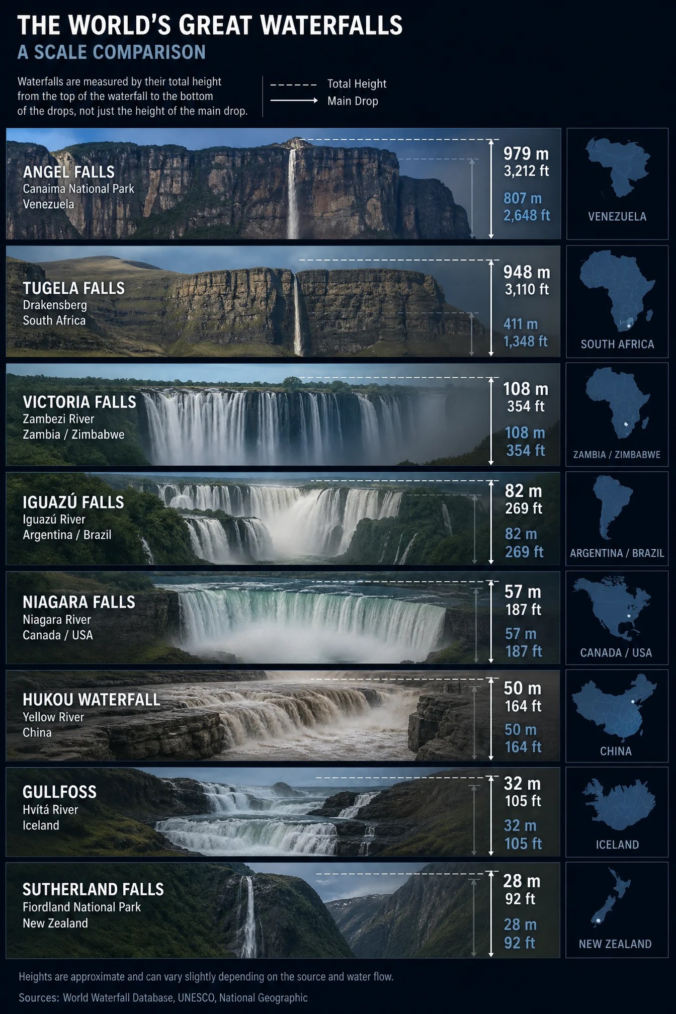
Controlled:
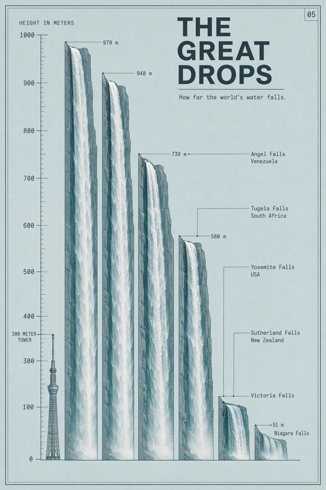
What to notice. This entry ships with its scar on purpose, because the scar is the lesson. The first take scrambled its heights and invented a waterfall that does not exist. The pinned retry got every number right, 979, 948, 739, 580, and still shifted the name column one row against the falls, Angel Falls’ label pointing at Yosemite’s column. One retry is the budget, so this keeper stands with its flaw named. The rule it teaches is the last line of quality control for any lineup poster: when names and numbers live in separate columns, check the pairing with your own eyes before you publish, every single time. The bare default, for what it is worth, had the heights nearly perfect and a sources box it invented out of habit.
Swap ideas. The great dams by height. Canyons by depth, one rim line. The tallest trees on one forest floor. Cave systems hanging below one surface line.
Prompt 6: The Pencil Tip Census, 3:2
Default:

Controlled:
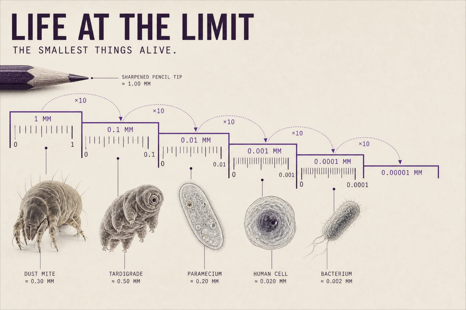
What to notice. The cleanest pass of the category, and proof that the datum can be an idea instead of a line: a ruler that zooms tenfold at every step, drawn with its magnification arcs, each jump mathematically correct. Every size came back real, mite at 0.3 mm, tardigrade at 0.5, paramecium at 0.2, human cell at 0.020, bacterium at 0.002, and the witness is the one object everyone has held one millimeter from their eyes, a sharpened pencil tip, rendered photoreal at the first step. When the subject cannot share one linear ruler, step the ruler and say so on the sheet. Honesty scales.
Swap ideas. Things smaller than a raindrop. What lives in one drop of pond water. Dust, pollen and ash on one stepped ruler. The wavelengths of light against a human hair.
The Method In One Box
Run the bare code first, always. Its instincts are strong on this category, its discipline is not, and seeing both is the lesson.
Keep the code as line 1. The lineup logic it brings is the engine.
Name the movement, then plan the datum before anything else: what is the ruler, where does it run, who is the witness.
Pin the roster. Write every subject and its real figure into THE DATA CARRY and close with never swapped, never repeated. This is the category’s one non-negotiable law.
Ground first, never pure white or black: this set runs midnight navy, mustard, sage, kraft, duck-egg, bone, one deep sheet with its reason stated.
Real specimens, drawn measurement. If the anchor starts eating the hero, say photographs placed onto the drawn sheet.
For historical machines, ban flags, insignia and national markings by name, in the default too if you ever need to show one.
Check the name-to-number pairing with your own eyes before publishing. Every lineup, every time.
Same ratio in the prompt’s FINISH line and the generation settings, medium quality at 2K.
One retry per image, only on a checklist fail, fix the single cause.
Common Issues And Fixes
Names drift off their numbers. The signature failure of lineup posters: real figures printed under the wrong subjects, three of six first takes had it. Fix: pin the roster with exact figures and close with never swapped, never repeated. Final check is always your own eyes on the pairing.
Historic machines wear historic insignia. The bare code drew period markings twice in a row on the airships, unshippable in a family-safe product. Fix: no flags, no insignia, no national markings, written into THE OBJECT, and into the bare code itself if a default must be shown.
The anchor eats the hero. A strong engraving tradition turned every animal into line art. Fix: the animals look like photographs placed onto the drawn sheet, and the anchor behaves.
Drawn positions drift from the printed ruler. A tower reaching 790 on a scale while labeled 828, a shark spanning six drawn meters while labeled sixteen. The printed figures are the contract, the drawing is the art. Check both, publish only when the printed layer is right.
Every label becomes a range. Defaults hedge, 24 to 30 meters, 12 to 13. The controlled poster prints one confident real figure per subject, the record, the official height, the measured length.
A subject gets invented. One take produced a waterfall that does not exist, name, country and all. Fix: the pinned roster ends with no others, no invented names, and you verify every name you did not already know.
Next Step
Run the ocean giants pair first and study what one ruler does to a subject the internet already loves. Then pin a roster of your own, anything with sizes, and build your lineup. Post your favorite before and after in the community. Page 3 leaves the ruler behind and hangs one idea on the wall: THE THEORY POSTER CODE, scientific poster of, where the equation is the hero and the evidence orbits it.
Section 03
THE THEORY POSTER CODE
A whole theory on one sheet, done for free. Then hung like it earned the wall.
Type "scientific poster of" and any big idea, and the model builds you a competent explainer: sections, diagrams, key takeaways, the works. This category’s defaults turned out to be the most knowledgeable in the entire vault, real formulas, real quotes, even real literature citations. And that is exactly where the danger moved: the knowledge arrives wearing portraits you cannot ship, QR codes you did not ask for, and the internet’s favorite misattributed quote. The controlled version keeps the knowledge, stages one tangible hero for the idea, and strips everything a paid product cannot carry. The code brings the theory. You bring the museum.
What The Code Actually Is
"Scientific poster of" points the model at the explainer-poster archive: classroom wall charts, conference posters, textbook spreads, educational YouTube thumbnails. On this category the archive runs deep, and it shows. In this production run the bare defaults produced the correct singlet-state formula for entanglement, correct Lorenz equations for chaos, the real Kelvin-Planck and Clausius statements for entropy, real evidence sections for plate tectonics, and real, checkable literature citations, Bell 1964, Aspect 1982, Nielsen and Chuang, Kittel, Feynman. The bare code on this category is not ignorant. It is a straight-A student with no judgment.
The four tells of the default, from this run. One, the crammed grid: nine panels, five fonts, no hero, nothing to look at first. Two, the portraits: Einstein arrived uninvited on one default, Darwin twice on another, real faces a family product cannot carry. Three, the invented chrome: QR codes stamped in corners that scan to nowhere, or worse. Four, the misattribution: the most shared "Darwin" quote on the internet, printed under his portrait, except Darwin never wrote it. The knowledge layer is excellent. The judgment layer is yours.
The Control Layer
This set runs under one named movement: The Idea Monument. Each poster monumentalizes one governing idea. The equation or principle sits like a plaque, one tangible hero stages the idea in the real world, and the evidence orbits quietly.
STYLE THE CODE protects the explainer DNA, the one-sheet teaching structure, and the sense of a theory laid out to be understood.
THE ART DIRECTION rotates six named traditions across the set, mid-century gouache for the drifting continents, naturalist engraving for the finches, seventies airbrush for the entangled pair, Japanese manual for the molecule, risograph for chaos, and a Swiss grid drawn in chalk for entropy. One composition device and one quiet quote each.
PALETTE LOCK holds the ground law. This set runs terracotta, oatmeal, deep aubergine (dark because two points of light need the dark between them), gallery gray, dusty rose, and a chalk-dusted charcoal blackboard (dark because entropy belongs on a lecture blackboard, and chalk dust is disorder itself). Two darks, both with their reasons stated inside the prompt.
THE CONCEPT is this category’s hero block. An abstract idea becomes one tangible thing: a real slice of the planet for tectonics, a real row of finches for selection, two real points of light for entanglement, one real molecule transforming for the central dogma, a real butterfly against drawn storms for chaos, a real melting ice cube for entropy. The idea stays drawn, the hero stays real.
THE DATA CARRY keeps the honesty: real figures the model already knows, a callout cap, and this category’s additions, earned in production: no portraits, no invented researcher names, no QR codes, and no equations the model is not certain of.
TYPE SYSTEM, LABEL DISCIPLINE and FINISH hold the vault law: two typefaces, three sizes, small-caps headers, hairline leaders with terminal dots in the margins, and a named print process.
Prompt 1: The Drifting Plate, 2:3
Default:
Controlled:

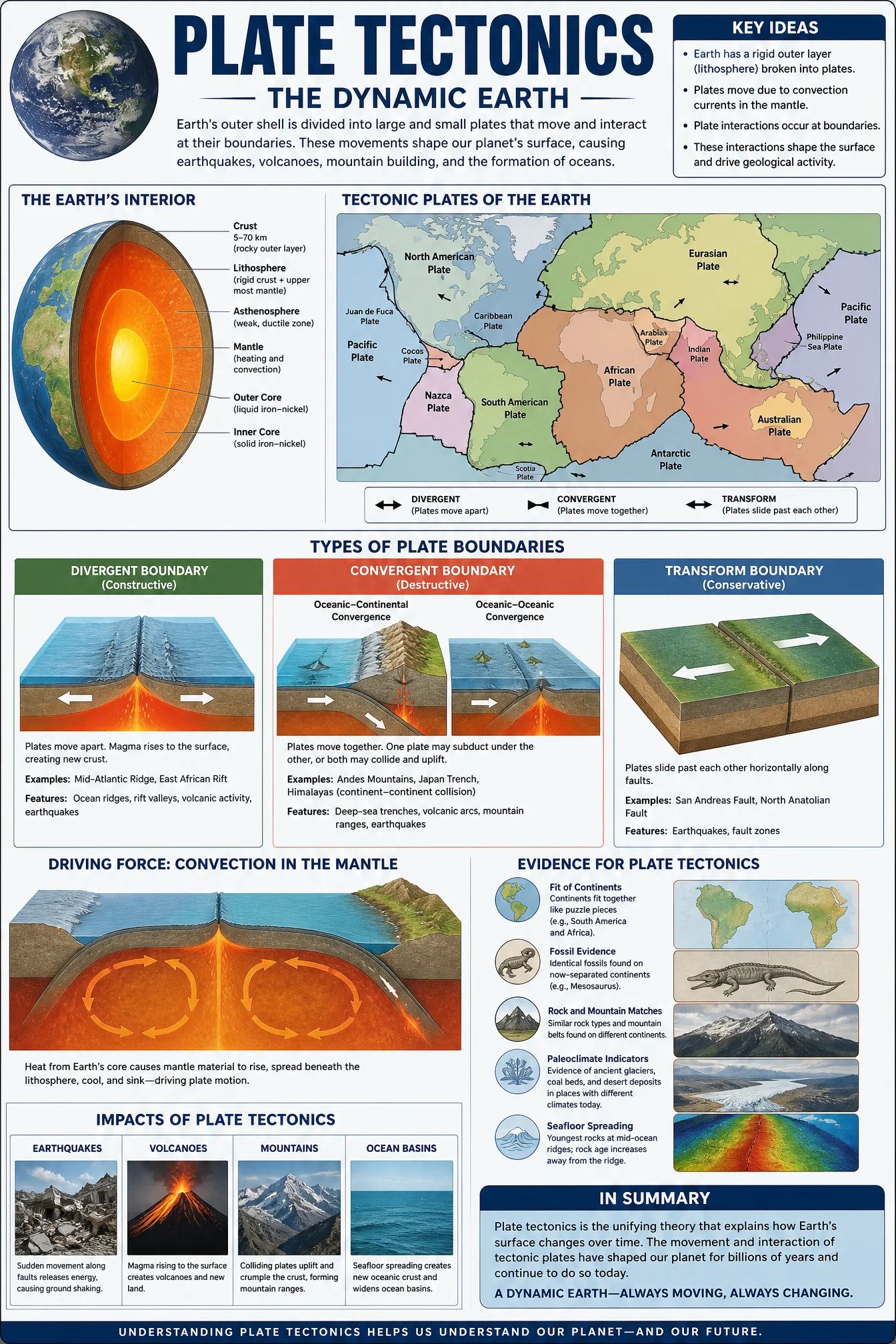
What to notice. The default is a competent classroom wall chart, nine panels, a real plate map, correct boundary types, and absolutely nothing to look at first. The controlled version bets everything on one hero, a cutaway arc of the living planet, and the bet pays. Every figure came back real and specific: plates at 2 to 10 centimeters per year, the Pacific Plate’s 7.5 northwest, Pangaea breaking at 200 to 175 million years ago, and the quiet quote turned into a five-globe drift sequence from the Permian to today with correct epochs. One design note worth stealing: the magma ramp lives only inside the planet, so the single warm glow at the heart of a terracotta sheet reads like the engine of the whole theory, which is precisely the point.
Swap ideas. The rock cycle as one loop. How mountains rise and fall. The water cycle drawn as a machine. Why earthquakes cluster where they do.
Prompt 2: The Finch Row, 4:5
Default:
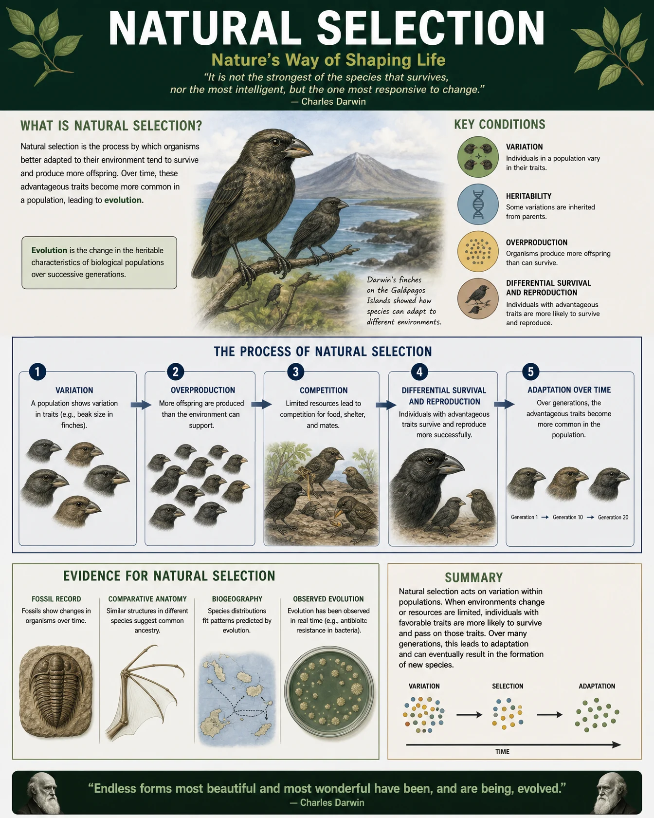
shown with one safety clause added, see the note below
Controlled:
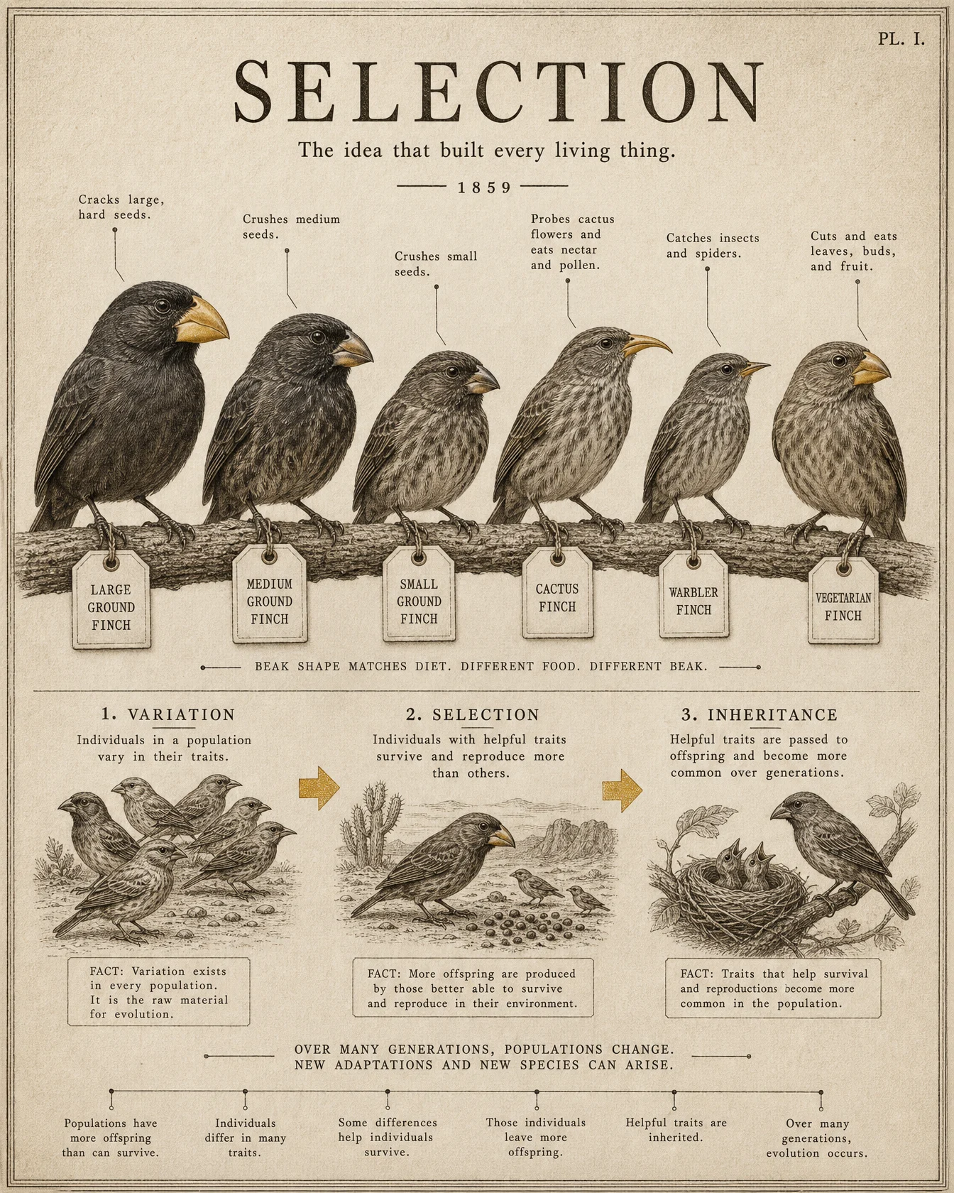
What to notice. This entry earned two scars, and both became law. The bare default arrived with Darwin’s portrait in both corners and, printed proudly beneath his name, the most famous thing Darwin never said, the survival-of-the-most-responsive quote that actually belongs to a management professor a century later. So the shown default carries one safety clause, no real people, and the real lesson: when a default quotes a famous scientist, check the quote before you believe the attribution. The first controlled take then scrambled its Latin, swapping the large and medium ground finch binomials and mislabeling the warbler finch, the roster-pin lesson from Page 2 wearing feathers. The retry above solves it the honest way: English names only, no binomials anywhere. If a detail is only there to look scholarly, and you cannot verify it at a glance, ban it.
Swap ideas. Antibiotic resistance as selection running in fast-forward. The peppered moth story. Artificial selection, from wolf to lapdog. Sexual selection, the peacock’s expensive argument.
Prompt 3: The Quiet Pair, 9:16
Default:

shown with one safety clause added, see the note below
Controlled:
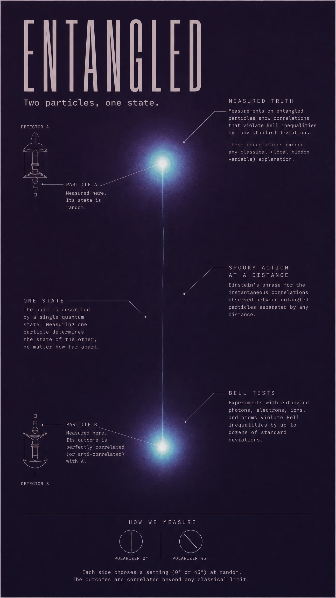
What to notice. The bare default here was the most knowledgeable image of the entire vault: the correct singlet state written in proper notation, a correct Bell correlation curve, a real Wigner quote, and four real literature citations down to page numbers. It also carried Einstein’s photograph and an invented QR code, which is why it lives in the rejects folder and the shown default carries the safety clause. The controlled version makes the opposite bet: five callouts instead of forty, and a design built from emptiness, two lit particles and a thread across a vast aubergine quiet. The restraint is the physics: the mystery of entanglement is the nothing between the particles, and the poster gives that nothing two thirds of the sheet. When your subject is stranger than any decoration, decorate with silence.
Swap ideas. The double slit experiment, one particle, two paths. Superposition before measurement. Quantum tunneling through the impossible wall. The uncertainty principle as a trade you cannot refuse.
Prompt 4: The Molecule’s Journey, 4:5
Default:
Controlled:
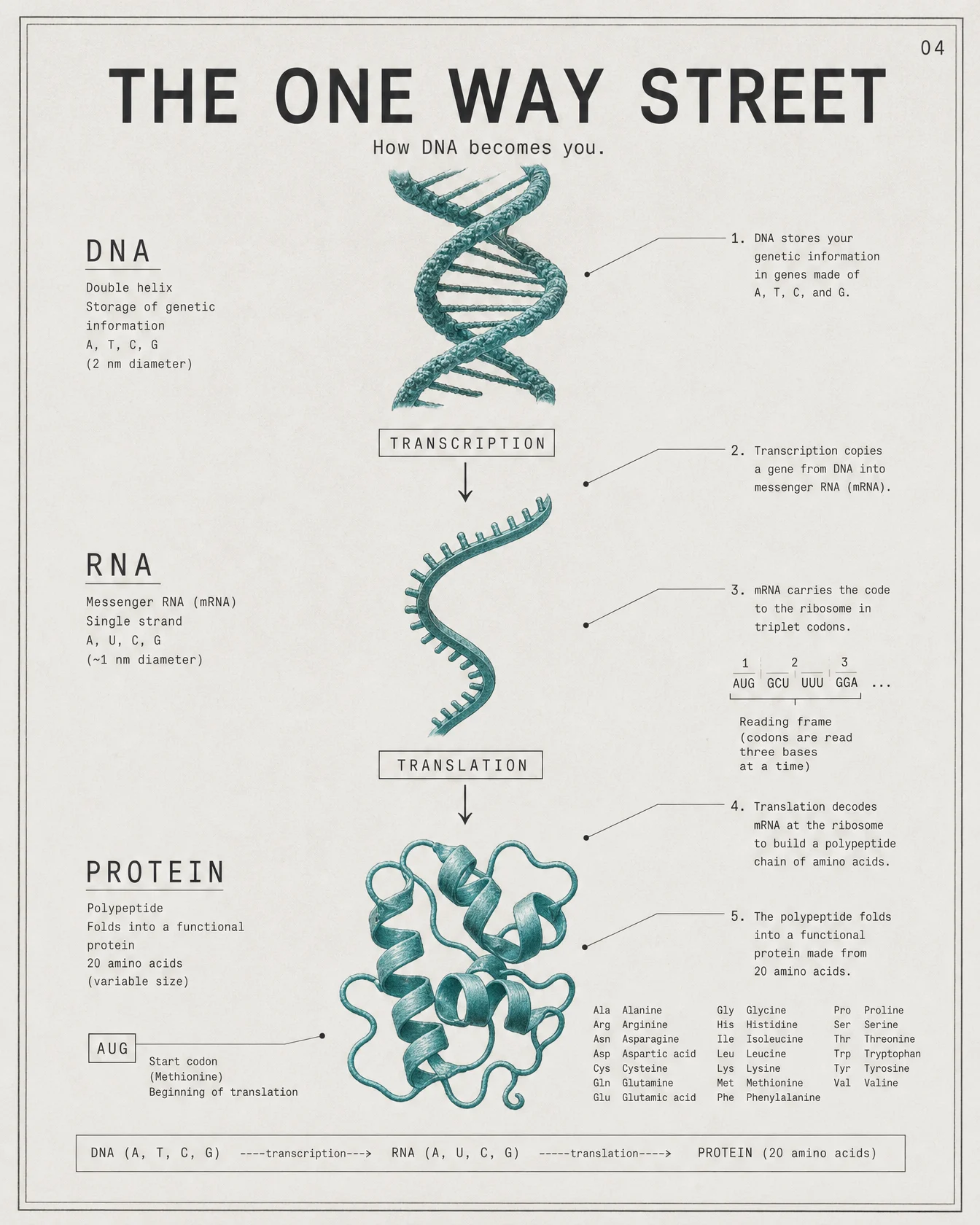
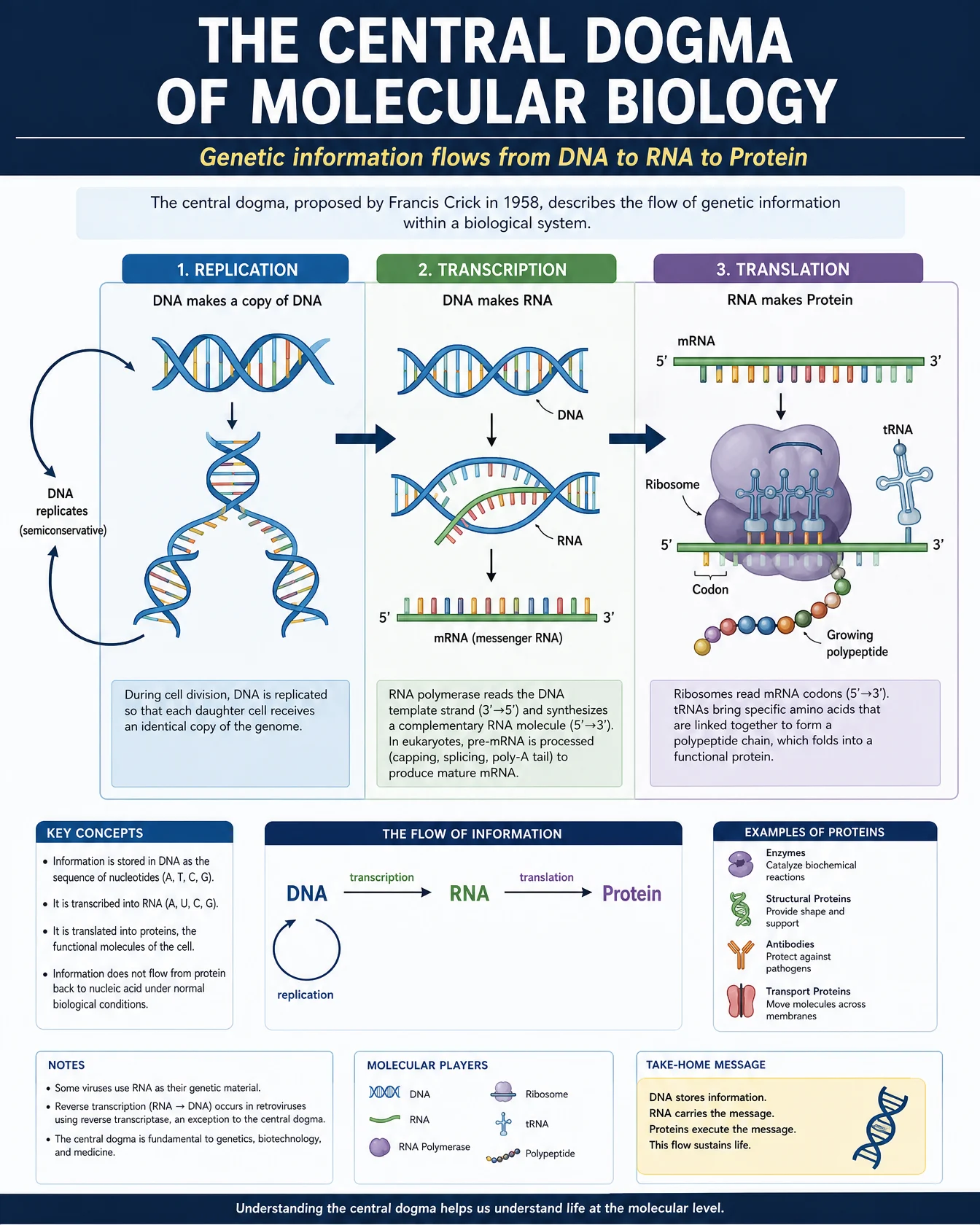
What to notice. The controlled version came back essentially perfect, and it is worth being precise about what perfect means here: valid codons in the reading frame example, AUG correctly tagged as the start, and the complete table of all twenty amino acids with correct three-letter abbreviations, every single one. When the subject is a fixed, finite system that the model has seen a thousand times, the data carry can ask for the whole system and get it. The design lesson is the one continuous molecule: a single teal thread that is a double helix at the top and a folded protein at the bottom, so the poster’s one color literally performs the theory. When your subject IS a transformation, make one object transform.
Swap ideas. How enzymes lock and key. Photosynthesis as a factory line. How CRISPR edits a sentence of DNA. How a neuron fires and resets.
Prompt 5: The Diverging Fans, 3:2
Default:
keep as generated, note the invented QR code below
Controlled:
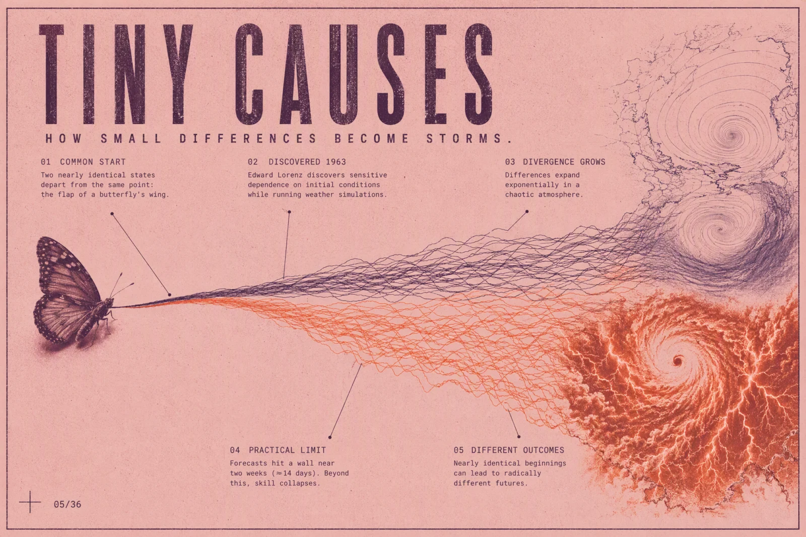
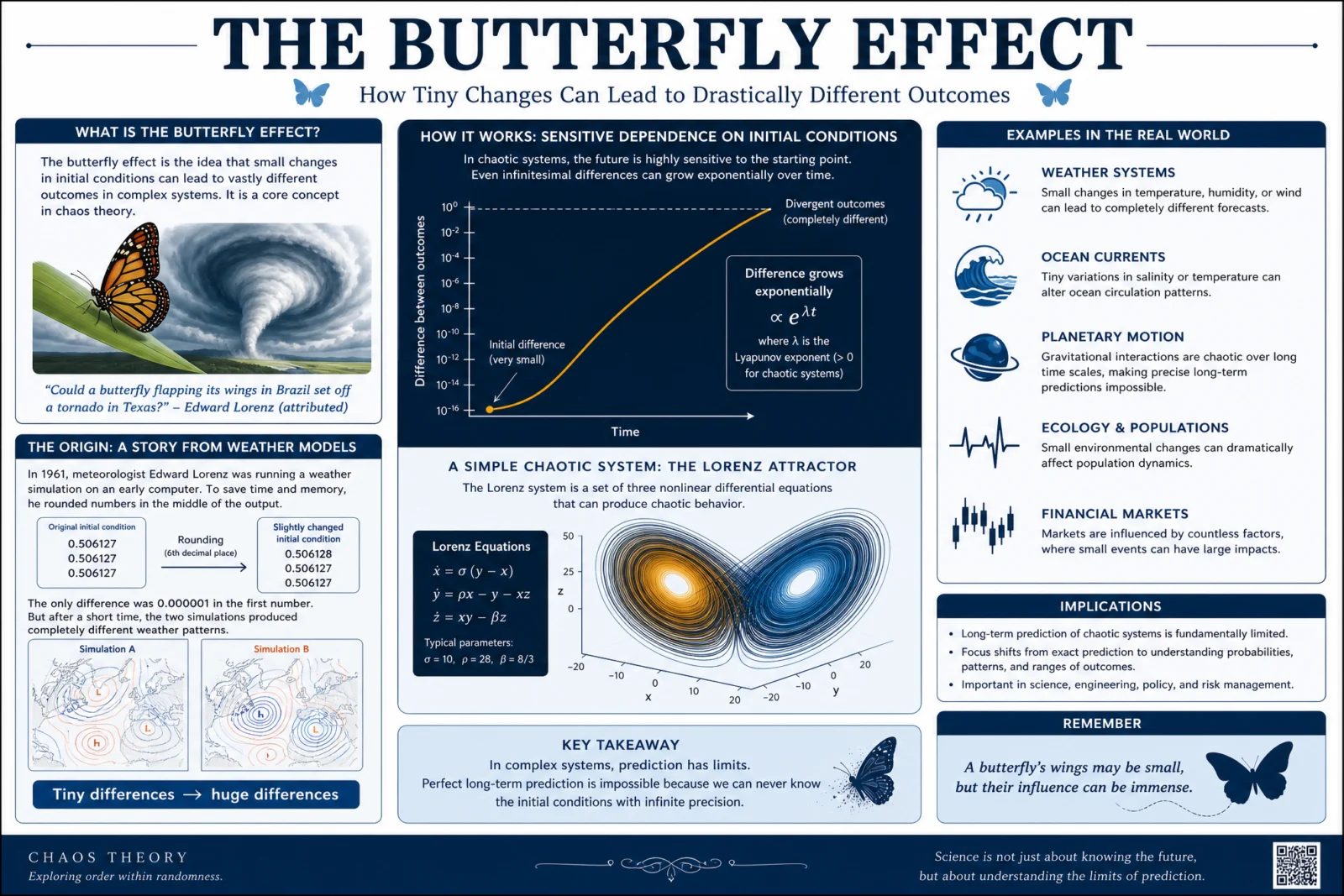
What to notice. The bare default deserves respect: the real Lorenz story with the actual rounded number from 1961, correct Lorenz equations, and the honest word "attributed" on the tornado quote, which is more scholarly care than most human posters manage. It also stamped an invented QR code in the corner, so the default ships with a warning instead of a safety re-roll: assume any QR a model draws is garbage or worse, and never publish one. The controlled version turns the whole theory into one readable picture, two trajectory fans leaving a single point and refusing to stay together, plum and ember, calm and storm. The two-ink risograph is doing real work here: with only two ink colors available, divergence is the only story the poster can tell. Constraint as clarity.
Swap ideas. Why you cannot un-mix coffee and cream. The three-body problem, one dance no one can predict. Feedback loops, how microphones scream. The tipping point, drawn as a landscape.
Prompt 6: The Melting Plaque, 2:3
Default:
Controlled:
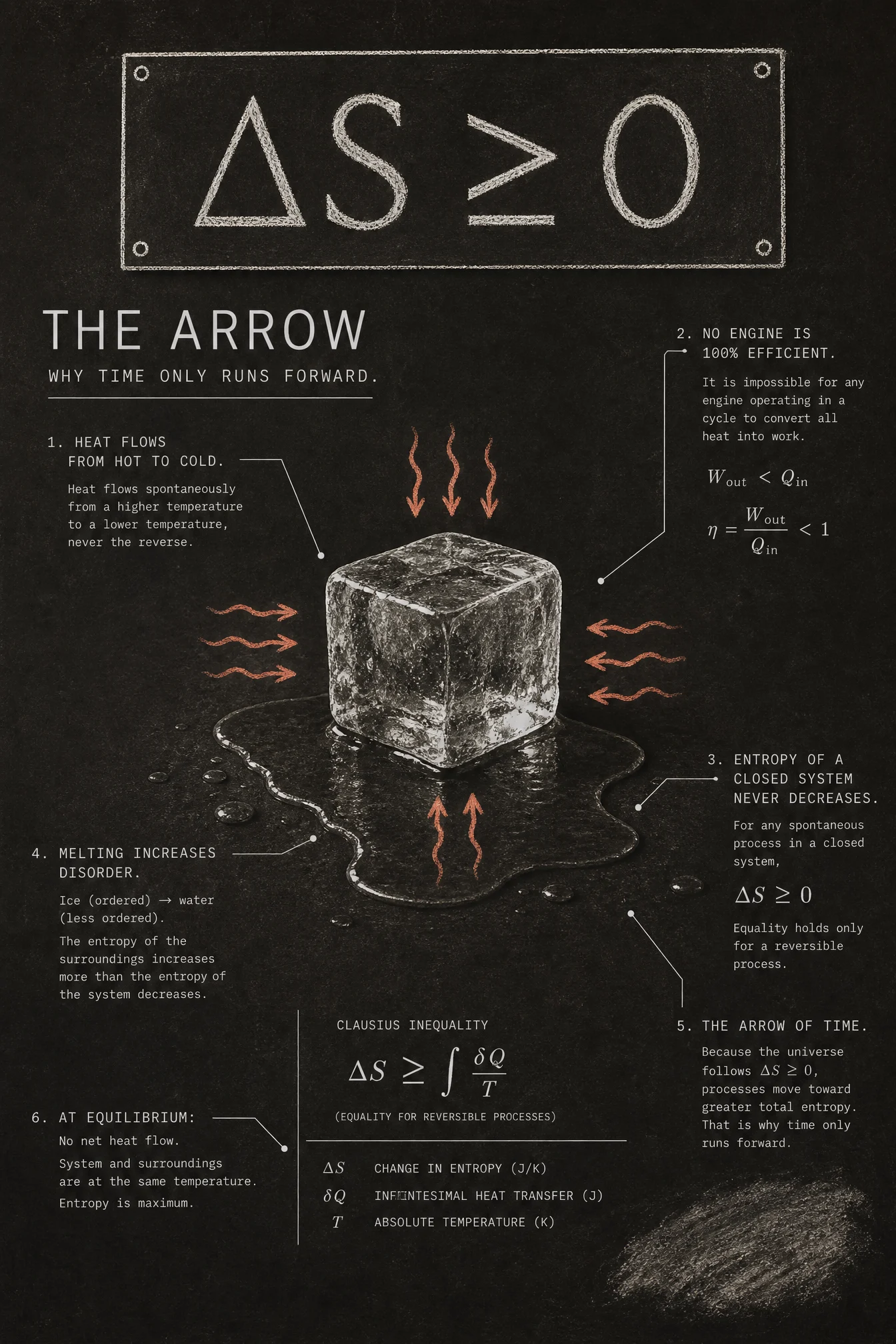
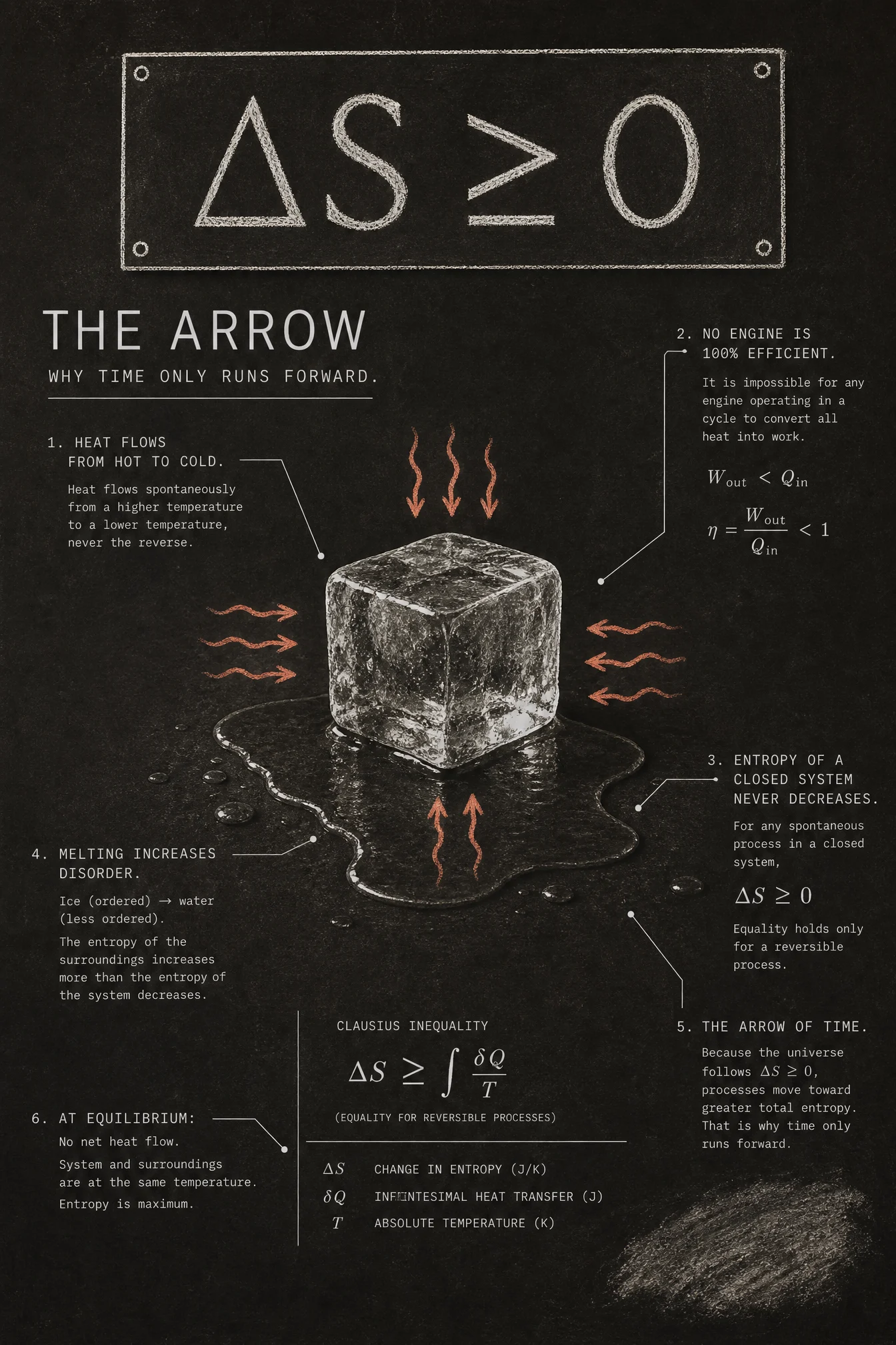
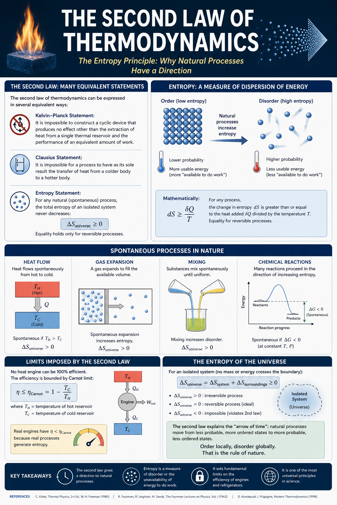
What to notice. The controlled version is the page hero for a reason. The physics came back correct at a level that should not be taken for granted: the Clausius inequality written properly with its integral, the engine efficiency bound stated right, and the subtle point most posters get wrong, that melting ice increases the entropy of the surroundings more than the system’s order decreases. The photoreal ice cube on a drawn chalk grid is the vault’s cleanest real-hero-drawn-world statement, and the eraser smudge earns its place as the one licensed piece of disorder on a Swiss sheet about disorder. One honest note: a single word in the small chalk legend rendered with a corrupted character, the recurring small-print tax of dense posters. Titles and data held. Read the fine print before you publish, always.
Swap ideas. Absolute zero, the wall at the bottom of cold. Conservation of energy, the ledger that always balances. Half-life, drawn as a fading choir. The speed of light as the universe’s speed limit.
The Method In One Box
Run the bare code first, always. On this category it will impress you, and then it will hand you a portrait, a fake quote or a QR code. Both halves are the lesson.
Keep the code as line 1. The explainer instinct it carries is the engine.
Name the movement, then choose each theory’s one tangible hero before writing anything. The hero is the poster.
Ground first, never pure white or black. This set runs terracotta, oatmeal, aubergine, gallery gray, dusty rose and chalk charcoal, two darks, both with stated reasons.
Ban what knowledge drags in: no portraits, no invented researcher names, no QR codes, no equations the model is not certain of, and English names when Latin ones cannot be verified at a glance.
Real figures with a callout cap, five to seven, and when the subject is a finite system the model knows cold, ask for the whole system.
Two typefaces, three sizes, small caps headers, labels in the margins with hairline leaders and terminal dots.
Print finish, stated ratio, same ratio in the settings, medium quality at 2K.
One retry per image, only on a checklist fail, fix the single cause.
Common Issues And Fixes
Portraits arrive with the knowledge. Einstein came uninvited on one default, Darwin twice on another. A family product carries no real faces. Fix: no real people, no portraits, written into THE DATA CARRY of every controlled prompt, and into the bare code itself when a default must be shown.
The famous quote is fake. The most shared Darwin quote on the internet appeared under his portrait, and Darwin never wrote it. Fix: check every quotation a default prints before you believe it, and let the controlled prompt carry only phrases you can verify, like spooky action at a distance.
QR codes appear from nowhere. Two defaults stamped invented QR codes. A generated QR is garbage at best. Fix: no QR codes in the prompt, and never ship one that slips through.
Latin scrambles. Species binomials swapped owners on the finch row, the lineup scramble from Page 2 wearing feathers. Fix: English names only when you cannot verify the Latin at a glance, or pin the exact binomials the way you pin any roster.
Small print corrupts. One chalk legend word rendered a broken character, the recurring tax on dense posters. Fix: demand cleanly legible print, keep the callout cap tight, and read the fine print before publishing.
The knowledge tempts you to keep everything. The entanglement default packed forty facts and was worse for it. Fix: the callout cap is the design. Five great callouts beat forty good ones, and the quiet zone is not empty, it is the point.
Next Step
Run the entropy pair first and study what one hero does for an abstract idea. Then pick any law, principle or theory you love, choose its one tangible hero, and build the monument. Post your favorite before and after in the community. Page 4 leaves the wall and goes to the sky: THE SPACE INFOGRAPHIC CODE, space infographic of, where the phenomenon is the hero and dark is spent only where the subject is darkness itself.
Section 04
THE SPACE INFOGRAPHIC CODE
The cosmos explained for free. Then printed on paper, in daylight, like the science annuals worth keeping.
Type "space infographic of" and any cosmic subject, and the model hands you a competent explainer with real anatomy: sections, numbered callouts, a glowing render in the middle. It will also hand you the same poster every time: black background, neon nebula, rainbow accents, software gradients. Space is the one category where the archive is almost entirely dark, so the default look is the strongest habit you will ever have to break. This set breaks it on purpose. The movement is The Daylight Cosmos: space explained on paper grounds, printed like mid-century science annuals, and dark is spent exactly once, on the one subject that is darkness itself. The code brings the cosmos. You bring the daylight.
What The Code Actually Is
"Space infographic of" points the model at the space-explainer archive: agency outreach graphics, planetarium posters, glossy magazine spreads, textbook diagrams, YouTube thumbnail science. That archive is deep and mostly correct on the physics, and almost uniformly black, glowing and oversaturated. The code reliably delivers the sectioned editorial structure, a hero phenomenon, orbit lines, stage sequences and numbered callouts. What it almost never delivers is restraint.
The tells of the default, from this run. One, the ground: six defaults, six black or near-black sheets, without a single exception. Two, the color: gradient titles, five differently colored section badges, neon glow on everything that moves. Three, and this surprised us, the knowledge is largely sound: the bare defaults printed the correct mass fork for dying stars, the real 7 minutes 32 seconds maximum for totality, the correct dual-tail physics, even the 5 degree orbital tilt that explains why eclipses skip months. The failures live in the fine print and the drawn geometry instead: one default spelled it "curmpletely," another printed "The Son is completely covered," and a third drew the photon sphere inside the event horizon, which is exactly backwards. The default knows the facts. It cannot proofread, and it does not check its own drawings.
The Control Layer
This set runs under one named movement: The Daylight Cosmos. Space is usually sold in the dark. This set explains it in daylight, on paper stocks, with the printing manners of the best science annuals ever made, and it spends darkness like money: once, with a stated reason, on the subject that is darkness itself.
STYLE THE CODE protects the explainer DNA, the sectioned editorial layout, the ordered stages, and the sense of one cosmic subject taught on one sheet.
THE ART DIRECTION rotates six named traditions across the set: mid-century gouache for the life of stars, seventies airbrush for the aurora, a Swiss grid for the black hole, an expedition field notebook for the comet, two-ink risograph for the Moon’s violent birth, and Japanese manual precision for the eclipse. One composition device and one quiet quote each.
PALETTE LOCK holds the ground law. This set runs oatmeal, slate blue-gray, deep midnight navy (dark because the subject is the darkness itself, and the sheet must stay one shade richer than the hole), aged chart cream, kraft brown and duck-egg blue. One dark sheet in six, with its reason stated inside the prompt. The star life cycle carries the vault’s single multi-hue exception, a blue-white to deep red ramp on the stars alone, because stellar color is temperature. That is the one place in thirty-six posters where more color is more honest.
THE EVENT is this category’s hero block. The phenomenon arrives real, placed like a photograph on the drawn sheet: real plasma spheres for the star stages, a real aurora curtain, a real lensed accretion disk, a real comet at three points of its orbit, a real Mars-sized impact frozen mid-splash, a real eclipsed Sun with its corona blazing. The mechanism around it stays drawn ink.
THE DATA CARRY keeps the honesty: real figures the model already knows, unchanged, a callout cap of five to seven, nothing invented for decoration, no sources box. On space subjects the model’s knowledge is strong, so the cap is doing the design work: the coincidence number for the eclipse, the fork in the stellar timeline, the two tails that are two different physics.
TYPE SYSTEM, LABEL DISCIPLINE and FINISH hold the vault law: two typefaces, three sizes, small-caps headers, hairline leaders with terminal dots in the margins, and a named print process.
Prompt 1: The Forked Timeline, 9:16
Default:

Controlled:
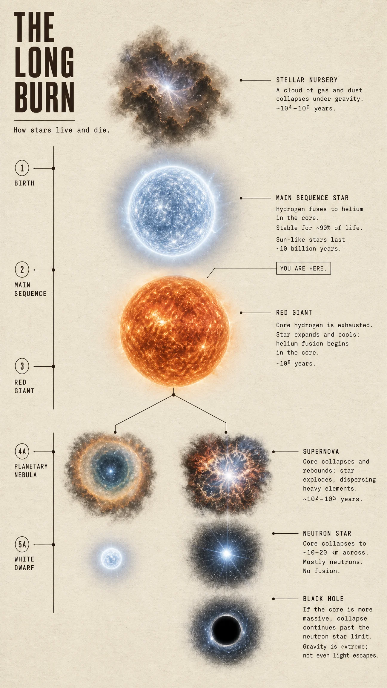
What to notice. The bet of the whole set pays off on the first sheet: the same stars that floated in black on the default now sit like photographs on warm oatmeal paper, and they look more real, not less. The temperature ramp stays exactly where the physics lives, blue-white main sequence to swollen orange giant, and the ten billion year figure landed as pinned. Two honest observations. The "you are here" tag drifted one stage down and points nearer the red giant than the main sequence star, a five billion year flattery we did not order: quiet quotes need pinning as much as rosters do. And the default actually beat the controlled version on one piece of information, the 8 solar mass threshold that decides a star’s ending, which the elegant version dropped. Restraint has a price; know what you paid.
Swap ideas. How the Sun makes its light, the fusion chain from core to surface. What a supernova leaves behind. Where the heavy elements are forged. The Hertzsprung-Russell diagram drawn as a map of every star’s fate.
Prompt 2: The Painted Pole, 2:3
Default:
Controlled:
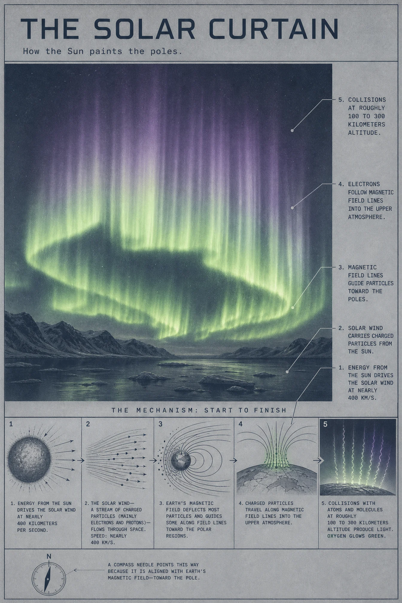
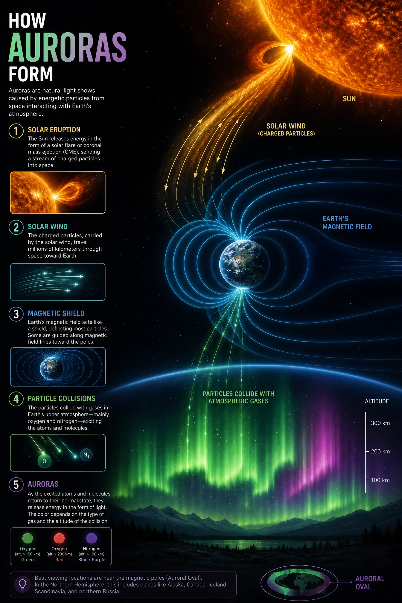
What to notice. The cleanest execution in the set. The framed aurora plate sits on the slate ground like a print in a workshop manual, the mechanism runs beneath it in five drawn panels, Sun to pole, and every pinned figure arrived intact: 400 kilometers per second, 100 to 300 kilometers altitude, oxygen glows green. The green-to-violet ramp never leaves the curtain and the particle paths. The compass needle quiet quote landed at the bottom with its caption. Compare it against the default’s five colored section badges and gradient title to see what one ink, one ramp and one idea buy you. If you steal one composition from this page, steal this one: photograph above, mechanism strip below.
Swap ideas. How the magnetosphere shields the planet, drawn as armor. What a solar flare actually is. The Van Allen belts, the invisible doughnuts. Why compasses point north, the field drawn from core to sky.
Prompt 3: The Bright Void, 4:5
Default:
Controlled:
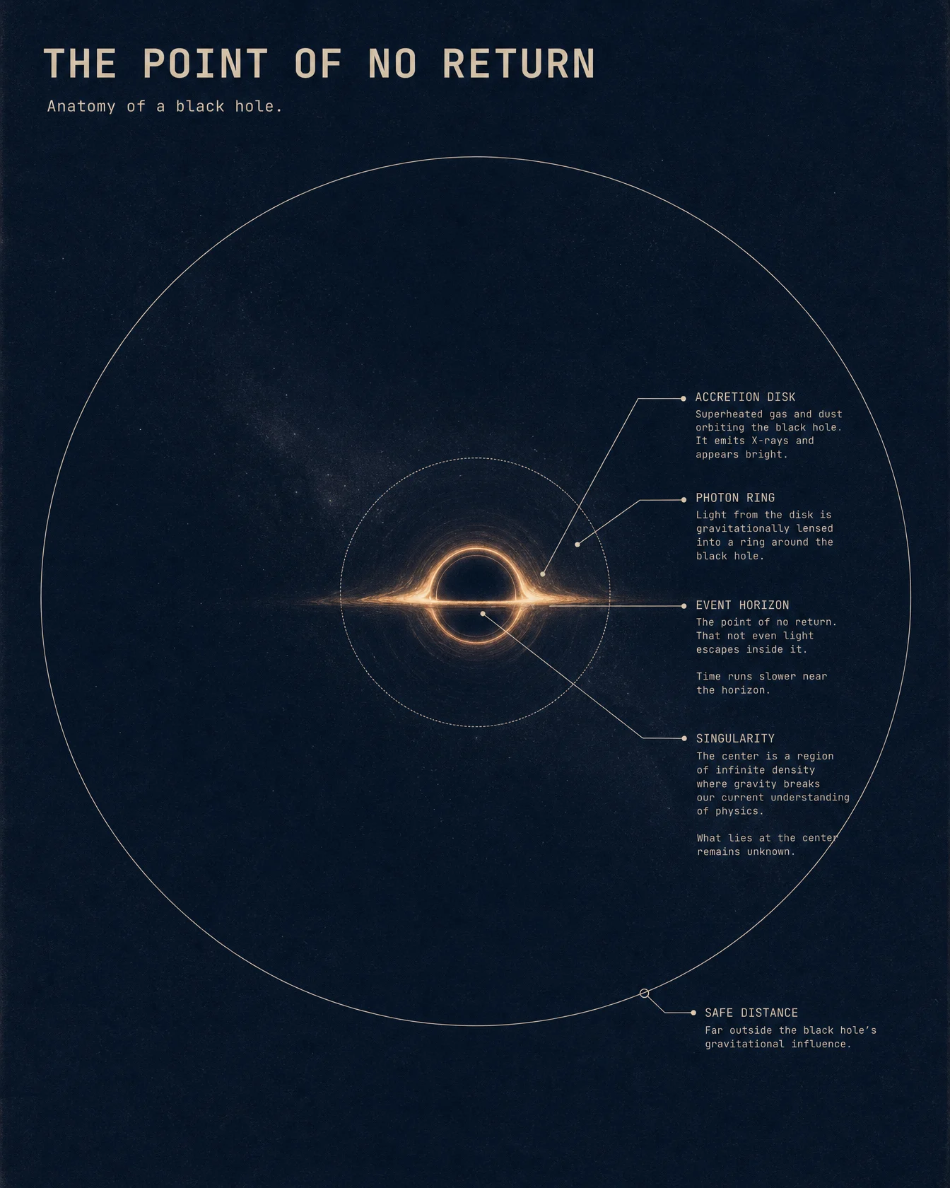
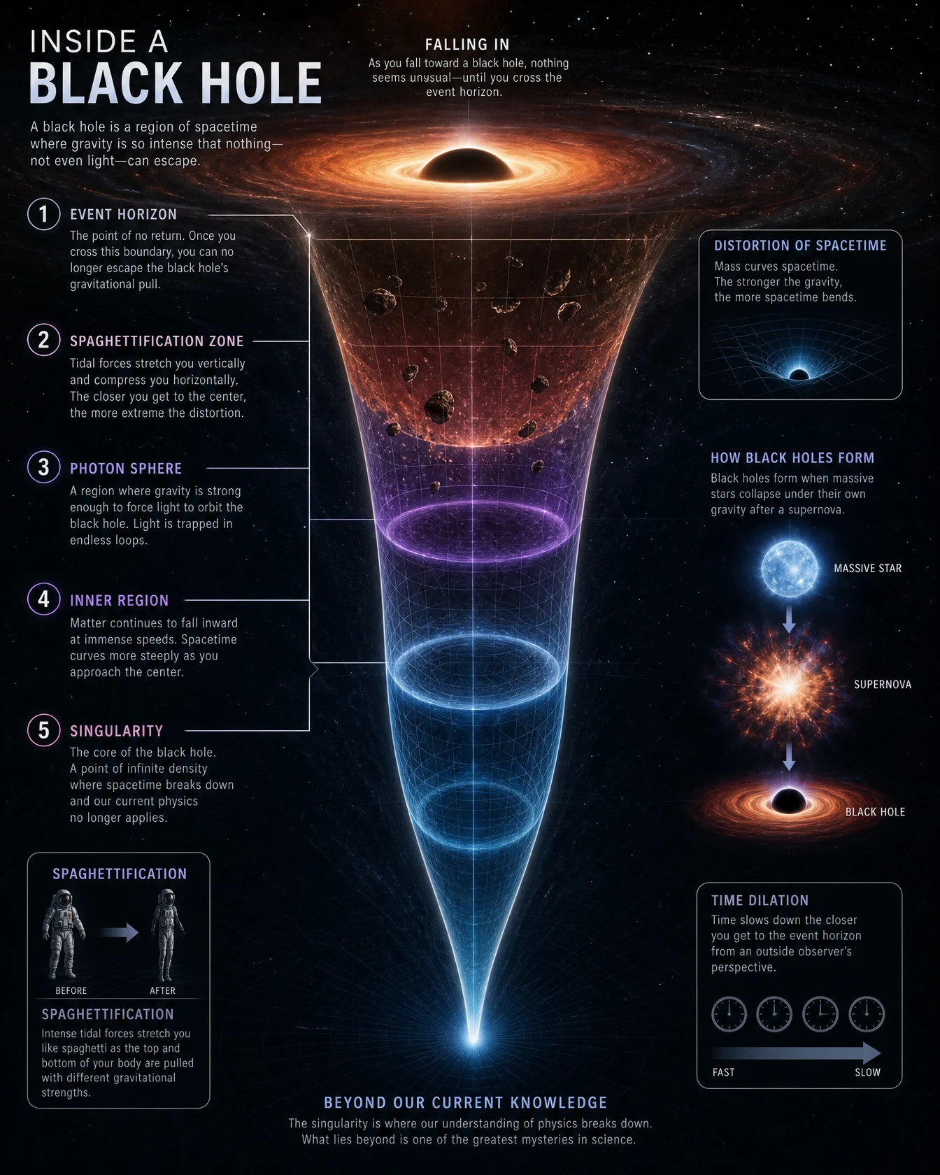
What to notice. The set’s one earned dark, and the argument for pricing darkness. The default drew the pop-science funnel and stuffed it with five zones, and in the stuffing it placed the photon sphere inside the event horizon, which no photon would survive. The controlled version puts a small lensed disk at dead center of a vast navy field, spends its only warmth on the photon ring, and holds the callout cap at exactly five, with the singularity kept as an open question rather than a fake certainty. The safe-distance circle drawn far outside the horizon does the scale work a funnel never could. One flaw shipped: the event horizon caption reads "The point of no return. That not even light escapes inside it," a dropped word the fine-print pass caught after the fact. The facts held; the grammar wobbled. Read everything before you publish.
Swap ideas. Spaghettification, the honest word for the worst trip. How gravitational lensing bends the light of whole galaxies. Stellar black holes against the supermassive monsters. How two black holes merging ring space like a bell.
Prompt 4: The Tail-First Traveler, 16:9
Default:
Controlled:

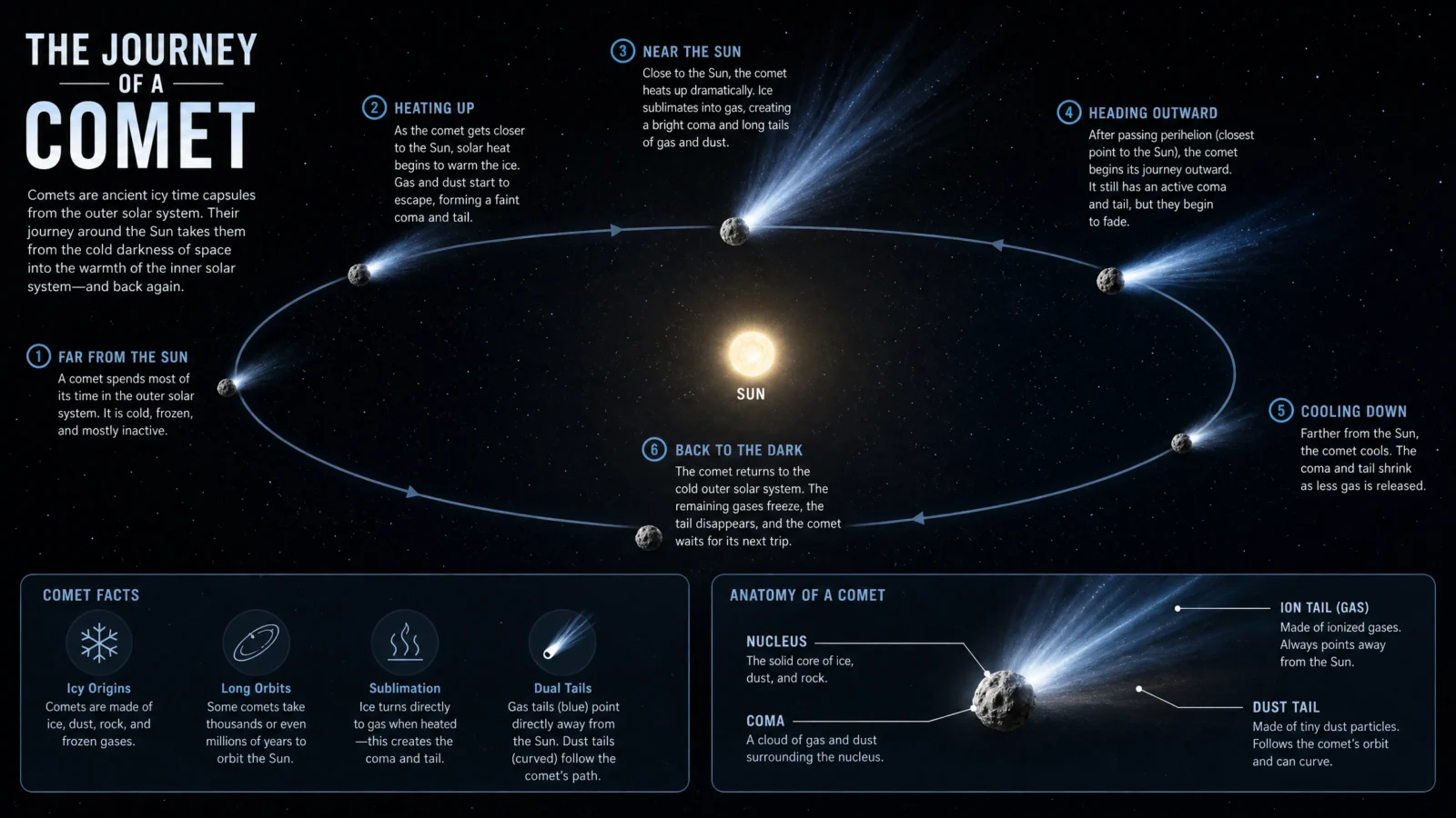
What to notice. Every printed word on this sheet is correct: the ion tail exactly anti-solar, the dust tail curving along the orbit, the tail-first departure, and a parameters box of genuinely real ranges, nucleus 1 to 20 kilometers, 10 to 70 kilometers per second, tails up to a hundred million kilometers. The drawing is where the lesson hides. The great tail fan at perihelion sweeps closer to the orbit line than the anti-solar line the labels describe, and the Sun sits at the drawn ellipse’s center while callout 1 correctly says focus. The text layer and the picture layer are generated by different instincts, and only one of them read the physics. When a diagram must be right, pin the geometry in words the way you pin a roster: the Sun at one focus, the tails on the anti-solar line, drawn exactly so.
Swap ideas. Where comets come from, the Kuiper Belt and the Oort Cloud drawn to scale. Asteroid, comet or meteor, the field guide. How a meteor shower is a comet’s litter. Halley’s orbit, the once-a-lifetime clock.
Prompt 5: The Debris Ring, 16:9
Default:
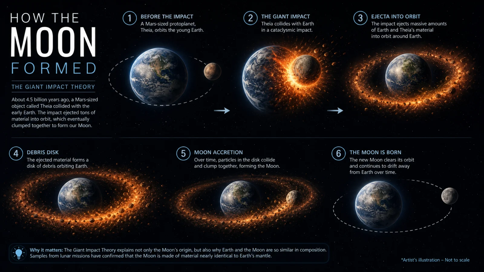
Controlled:

What to notice. The risograph gamble works: a planetary collision told in two inks on packing paper, ember burning only in the impact and the debris, and the sequence lands in perfect order, collision, ring, gathering, Moon. Theia, the Mars-size figure and 4.5 billion years all printed true, and the registration cross and edition number 05/36 arrived exactly as ordered. Two honest notes. Panel two spells it "OBRIT," the vault’s recurring small-print tax collected once again, this time on a controlled take; the retry lane for this sheet is noted at the wrap for a single optional re-roll. And the healed Earth of the final panel reads as a second gray moon, which is the palette lock being honest: a two-ink print cannot afford blue oceans, so if you need a blue Earth, budget a third ink and say why.
Swap ideas. Why the Moon is slowly leaving us, centimeters a year. Tides, the Moon’s daily pull drawn as a mechanism. Why one side always faces us. The far side, the face we never see.
Prompt 6: The Matched Coins, 4:3
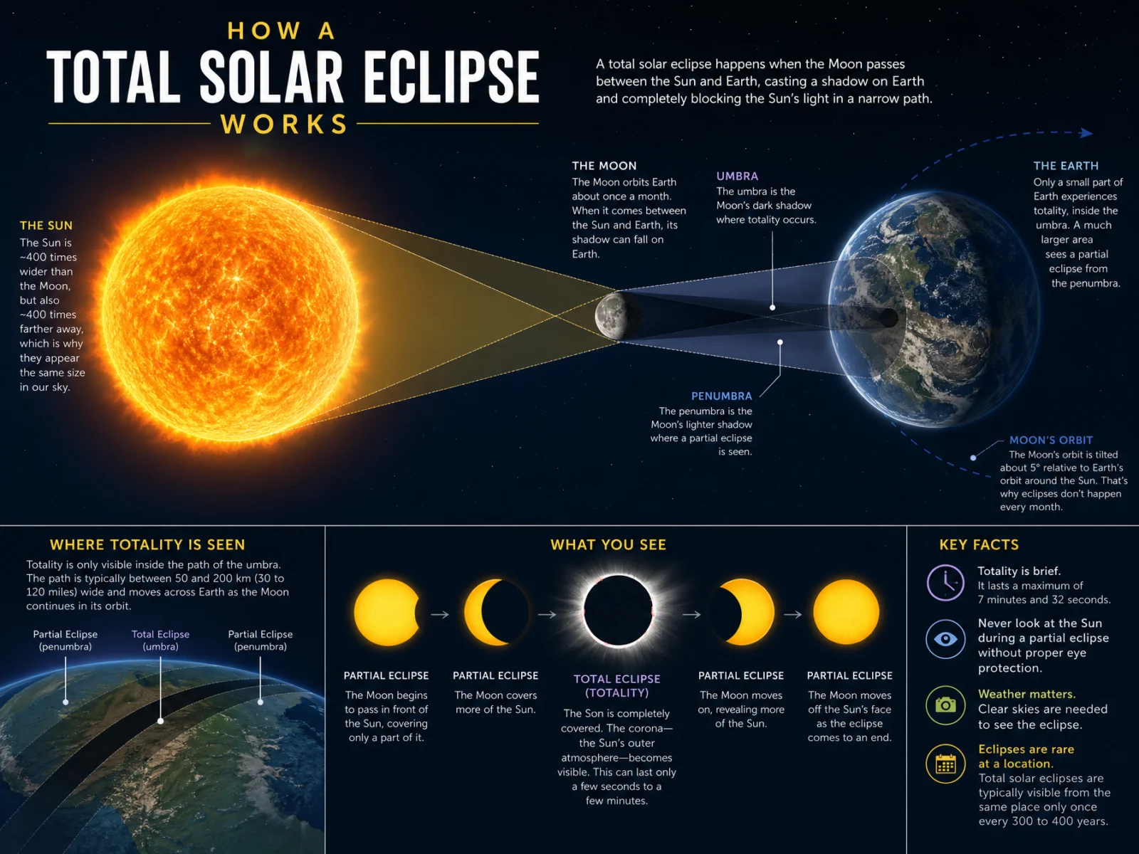
Default:
Controlled:
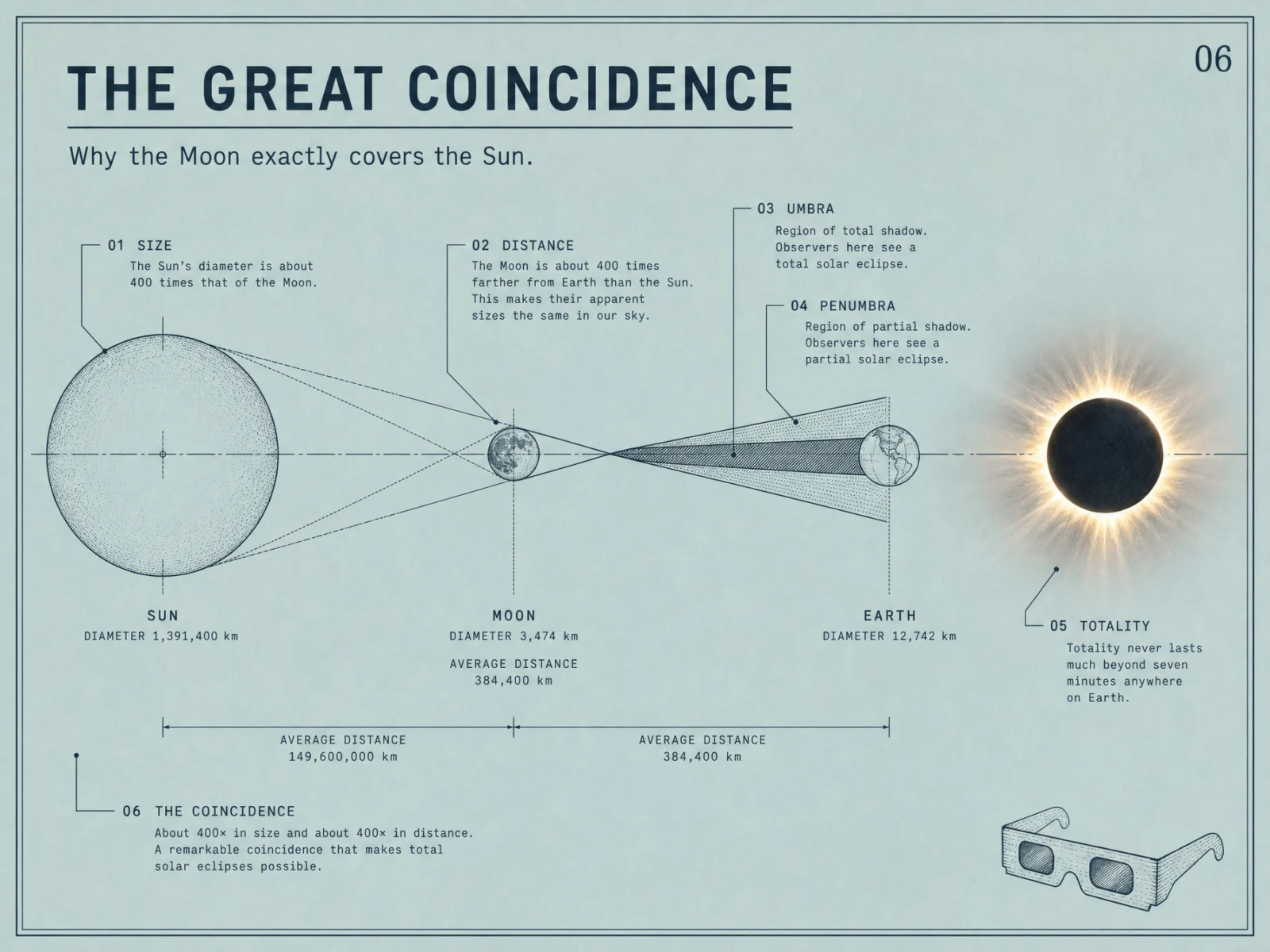
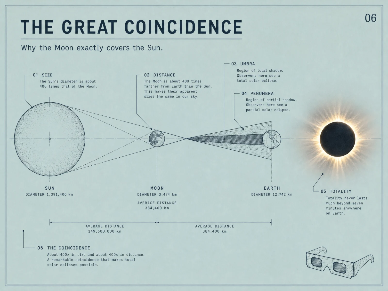
What to notice. The page hero, and the sheet that best states the whole movement: the most dramatic event the daytime sky can produce, explained in hairline ink on calm duck-egg paper, with gold spent on nothing but the corona. Every figure is the real record, and not rounded: Sun 1,391,400 kilometers, Moon 3,474, Earth 12,742, distances 149,600,000 and 384,400. The 400 and 400 coincidence holds the composition together end to end, the umbra and penumbra sit on the correct cones, and the plate furniture all arrived, number 06, hairline border, the drawn eclipse glasses in the corner. Set it beside its default, which knew almost as much and printed "The Son is completely covered" in the middle of its showcase panel. Knowledge is cheap. Proofreading is design.
Swap ideas. Why we do not get an eclipse every month, the tilted orbit answer. Lunar eclipses and why the Moon turns red. The saros cycle, eclipses on a schedule. What totality does to the daytime sky.
The Method In One Box
Run the bare code first, always. On space subjects it will hand you the same black poster with different neon. Seeing the habit is how you learn to break it.
Keep the code as line 1. The explainer instinct, the sections and the ordered stages are the engine.
Name the movement before any prompt. The Daylight Cosmos made thirty design decisions before a single sheet was written.
Ground first, never pure white or black. Space earns paper too: oatmeal, slate, chart cream, kraft, duck-egg, and one navy spent where the subject is the dark.
Give every sheet one real event. The phenomenon arrives photoreal, placed like a photograph, and everything explaining it stays drawn.
Real figures with a callout cap, five to seven. On space the model knows plenty, so the cap is the design.
Grant a ramp only where color is physics: stellar temperature, two-physics tails, an aurora. Everywhere else, one ink plus one accent.
Two typefaces, three sizes, small caps headers, labels in the margins with hairline leaders and terminal dots.
Print finish, stated ratio, same ratio in the settings, medium quality at 2K.
One retry per image, only on a checklist fail, fix the single cause.
Common Issues And Fixes
Every default is black. Six defaults, six black sheets, the space archive’s one look. Fix: name the ground in PALETTE LOCK and give darkness a price. This set bought exactly one dark, for the one subject that is darkness itself, and paid for it with a stated reason.
The typo tax, collected three times. "Curmpletely" on the star default, "The Son" on the eclipse default, and "OBRIT" on a controlled take that passed every other check. Fix: demand cleanly legible print, keep captions short, and read every printed word before publishing. One uncaught word ships in this set with an honest note and an optional re-roll offered at the wrap.
The drawing contradicts the caption. The default put the photon sphere inside the event horizon. The controlled comet printed perfect tail physics in its labels while the drawn fan drifted off the anti-solar line and the Sun sat at the ellipse’s center under a caption saying focus. Fix: the text layer and the picture layer are different instincts, so when geometry is the story, pin it in words, the Sun at one focus, the tails anti-solar, drawn exactly so.
The quiet quote wanders. The "you are here" tag attached itself to the red giant instead of the main sequence star. Fix: a quiet quote is a callout like any other, name its exact anchor.
Next Step
Run the eclipse pair first, the geometry is simple and the coincidence sells itself. Then pick any phenomenon that made you look up, name its one real event, and explain it in daylight. Post your favorite before and after in the community. Page 5 stops explaining the universe and starts building in it: THE MEGASTRUCTURE CODE, megastructure diagram of, where impossible engineering gets drawn like a document from a firm that means it.
Section 05
THE MEGASTRUCTURE CODE
Impossible engineering for free. Then drawn like a document from a firm that intends to build it.
Type "megastructure diagram of" and any grand concept, and the model reaches for the concept-art shelf: glossy renders, lens flares, a tiny silhouetted human for scale, black space behind everything. Impressive for a game loading screen, worthless on a wall. This category makes one bet: the way to make an impossible thing feel real is not more glow, it is more paperwork. The movement is The Serious Dream. Every sheet is drawn like an engineering document from an office that has already ordered the steel: survey linework, dimension callouts, patient margins, and one photoreal window where the dream becomes touchable. The code brings the ambition. You bring the drawing office.
What The Code Actually Is
"Megastructure diagram of" points the model at the futurist archive: sci-fi concept art, space-settlement paintings, YouTube futurism thumbnails, game art, and a thin but real layer of published engineering studies. The word "diagram" pulls the layout toward callouts and cutaways, which is the half you keep. The word "megastructure" pulls the rendering toward spectacle, which is the half you tame. Left alone, the archive wins and you get cinema.
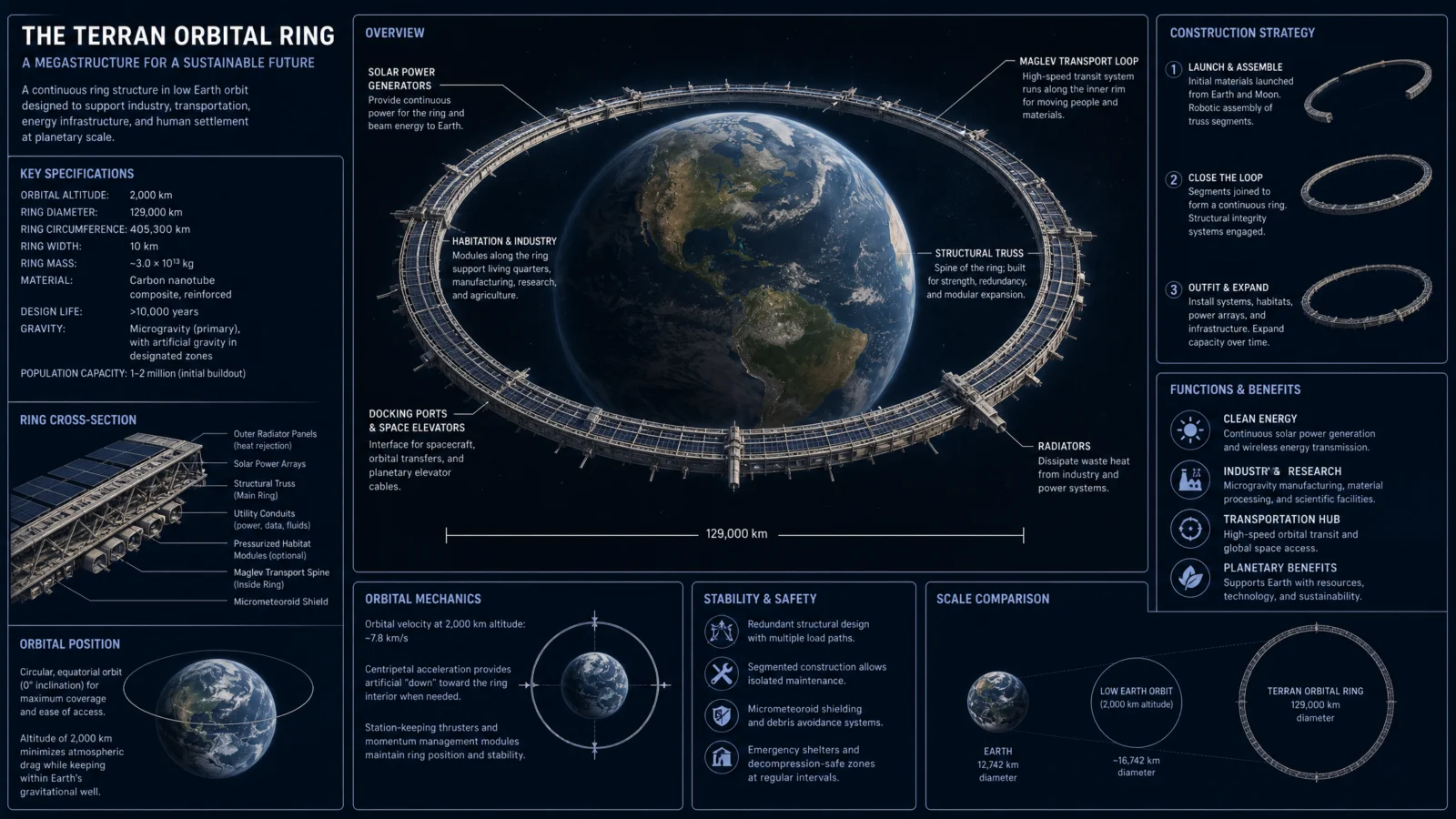
The tells of the default, from this run. Five of six defaults arrived as dark sci-fi dashboards, dense panels, glowing renders, specification boxes stacked to the margins. The sixth, the generation starship, came back on paper, proof that the word "diagram" sometimes wins the tug of war on its own. The deeper tell is the arithmetic. The O’Neill default printed the artificial-gravity formula, showed its work, and got its own worked example wrong by a factor of three and a half. The orbital ring default printed a 129,000 kilometer ring diameter in its spec box while its own scale panel, on the same sheet, correctly computed about 16,742 kilometers for the altitude it claimed. On speculative subjects the default does not just decorate, it invents specifications, and it does not check them against itself. Read every number twice.
The Control Layer
This set runs under one named movement: The Serious Dream. Unbuilt things drawn with a straight face, in the manners of real drawing offices, on paper stocks, with real published concept figures and an honest label where honesty is owed: concept, never built.
STYLE THE CODE protects the engineering-document DNA, the cutaway logic, the scale callouts, and the sense of a structure drawn to be built rather than admired.
THE ART DIRECTION rotates six named traditions across the set: Japanese manual precision for the elevator, seventies airbrush for the cylinder’s inner countryside, a vintage encyclopedia cutaway for the century ship, a Swiss grid for the orbital ring, an expedition field notebook for the buried city, and mid-century gouache for the ocean crossing. One composition device and one quiet quote each.
PALETTE LOCK holds the ground law. This set runs muted sage, oatmeal, deep midnight navy (dark because a voyage between stars is a night voyage), dusty terracotta, warm charcoal (dark because the city lives inside the Moon’s permanent night) and aged chart cream. Two darks in six, both with their reasons stated inside the prompt.
THE OBJECT is this category’s hero block. The structure stays drawn, and its life turns real through one opening: real woven cable at one break of the ribbon, real farmland curving up the cylinder wall, real lit terraces through the century ship’s cutaway, a real Earth wearing the drawn ring, real lamplit streets along the tube floor, a real maglev capsule at one break of the profile. The dream is drawn, the living part is photographed.
THE DATA CARRY keeps the honesty: only the real published figures of each concept, unchanged, a callout cap of six, nothing invented for decoration, no sources box. Where a thing has never been built, the sheet says so plainly. Speculative subjects are exactly where invented numbers creep in, so the carry is stricter here, not looser.
TYPE SYSTEM, LABEL DISCIPLINE and FINISH hold the vault law: two typefaces, three sizes, small-caps headers, hairline leaders with terminal dots in the margins, and a named print process.
Prompt 1: The Hanging Ribbon, 9:21
Default:

Controlled:
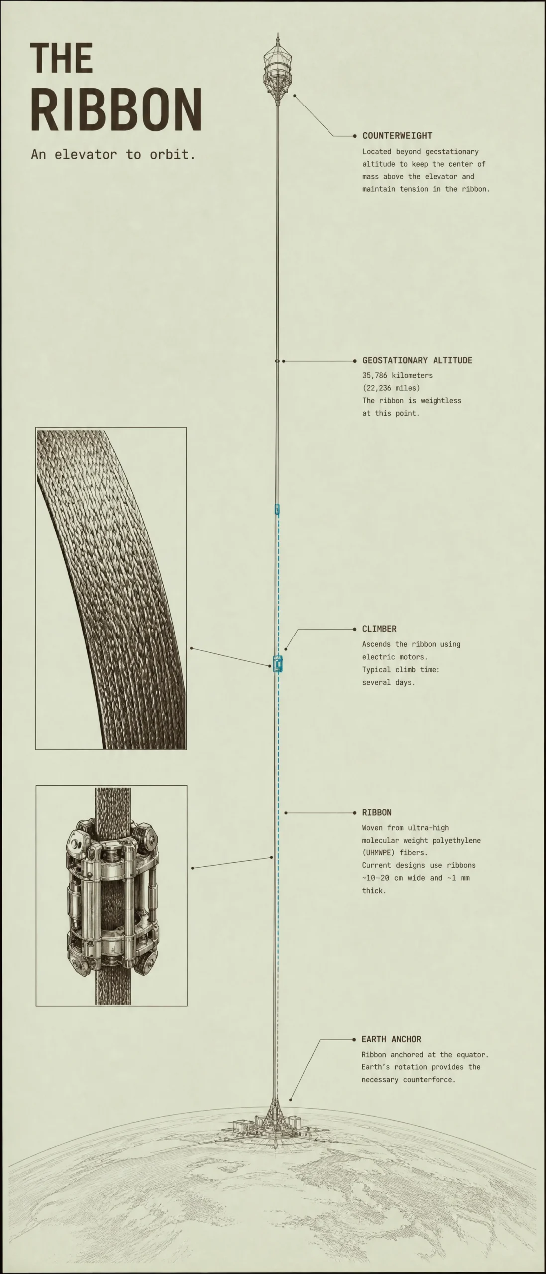
What to notice. The most vertical sheet in the vault does exactly what the ratio promised: one ribbon, full height, Earth’s curve small at the foot, the counterweight lantern at the top. The geostationary tick landed at 35,786 kilometers with the weightless note intact, the climb takes days as pinned, and the cyan stays on the climber. The two photoreal breaks, woven cable and climber metalwork, give the drawing its proof of life. One data lesson earned: the ribbon callout names UHMWPE fiber as the current design material, a real material with a real name that is genuinely proposed for lunar elevators and genuinely too weak for an Earth ribbon, where carbon nanotube designs rule the studies. The model reached for a true fact from the wrong shelf. On speculative subjects, verify the material the way you verify a quote.
Swap ideas. A skyhook, the rotating tether that snatches payloads to orbit. A mass driver on the Moon, the electromagnetic runway. A launch loop, eighty kilometers of accelerator held up by its own motion. An orbital tower on Mars, where the physics gets easier.
Prompt 2: The Rolled Countryside, 3:2
Default:
Controlled:
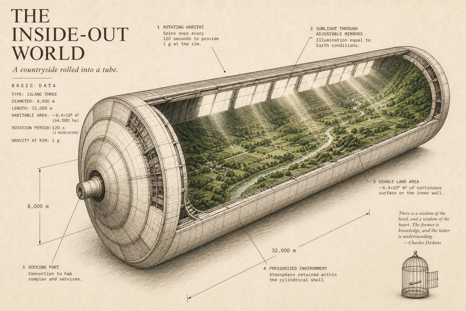
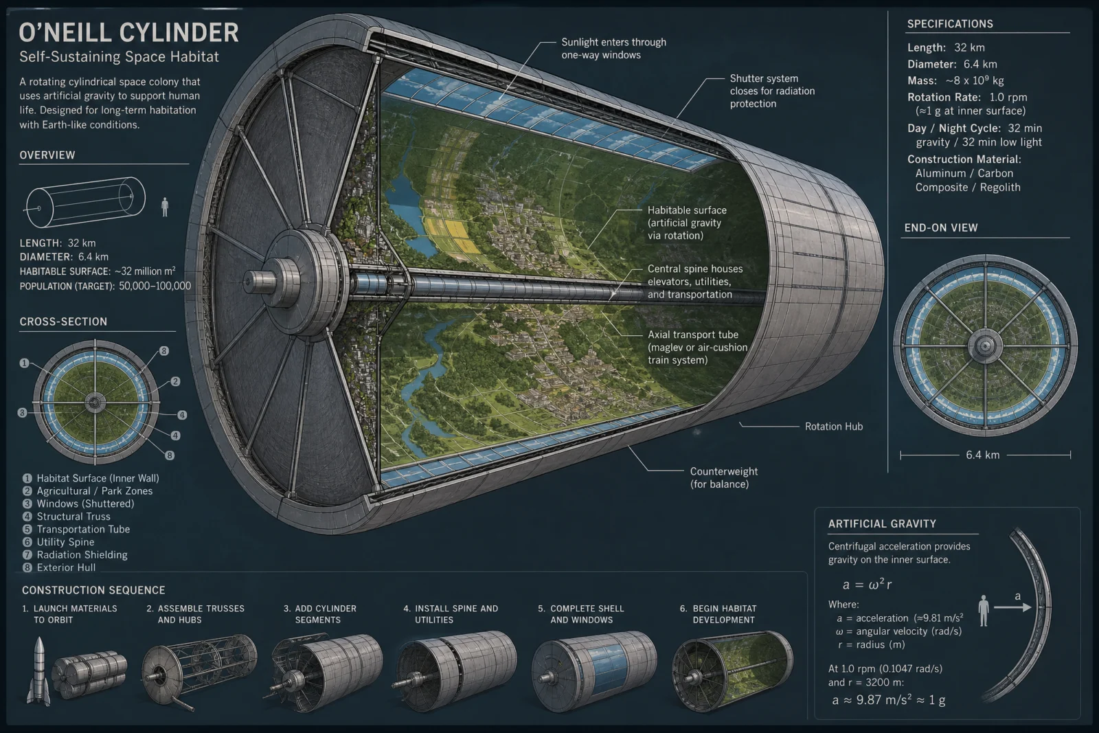
What to notice. The pinned figures came back exact where the default’s invented ones collapsed: Island Three, 8,000 by 32,000 meters, one revolution per 120 seconds for a g at the rim, about 64,000 hectares of inner land. Set that against the default, which drew a beautiful cutaway and then botched its own gravity math by a factor of three and a half. The verdant green never leaves the rolled countryside, the light shafts carry the only airbrush grain, and the river curves up the wall exactly as the physics says it should. Two grace notes to study: the ordered birdcage arrived drawn in the margin, open, and beside it the model volunteered an actual Dickens quotation, real and correctly attributed, because our term "quiet quote" was taken literally. When your art direction uses a house term, know that the model may read it as English. This time English paid.
Swap ideas. The Stanford torus, the wheel that almost got funded. A Bernal sphere, the small-town version. A hollowed asteroid city, walls of rock a kilometer thick. A rotating gateway station, the truck stop of the inner system.
Prompt 3: The Hundred-Year Hull, 21:9
Default:
Controlled:

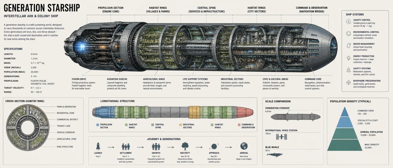
What to notice. The first earned dark, and it earns it: bone-ink decks on star-chart navy, warm windows of farms and quarters glowing through the cutaway, the ember saved for the fusion heart at the stern. The planting calendar quiet quote came back better than ordered, a full crop table on a hundred year cycle ending "calendar repeats, life continues." Then the invented numbers teach their lesson. The voyage callout reads 250 generations in roughly 2,500 years, ten years to a generation, and the farm callout feeds 5,000 people from 1.6 hectares, a hundred times too little land. Both figures sound precise and both fail arithmetic you can do on your fingers. The pinned concept facts, generations not years, the closed loop, descendants of the departed, all landed clean. Pin what must be true. Audit whatever the model volunteers.
Swap ideas. The sleeper ship, the rival answer where everyone dreams instead. A laser sail starship, pushed from home by light. The farm deck alone, drawn as one working ecosystem. A world ship, when the vessel is the size of a country.
Prompt 4: The Planet’s Bracelet, 16:9
Default:
Controlled:
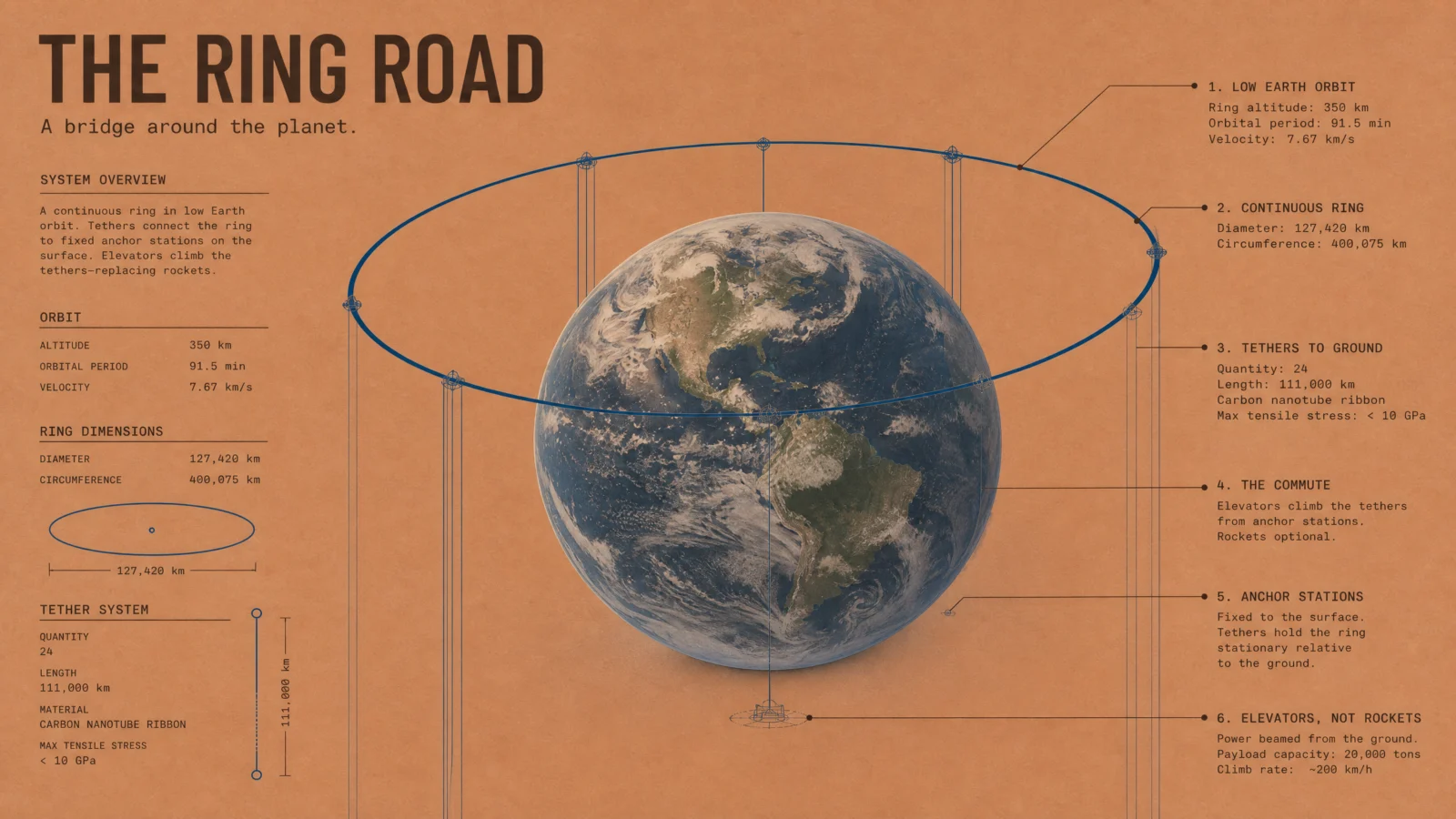
What to notice. The photoreal Earth wearing drawn petrol-blue geometry is the category’s thesis in one image, and the terracotta ground makes planetary engineering feel like a page from a firm’s presentation folder. Now the numbers, because this sheet hides the vault’s best data lesson. The orbital triple is perfect: 350 kilometers, 91.5 minutes, 7.67 kilometers per second, three figures that genuinely belong together. Then the dimensions box prints a ring diameter of 127,420 kilometers, which is exactly Earth’s 12,742 with one extra zero. The model recycled a real number and shifted its decimal. That is the tell to memorize: when a suspicious figure looks like a famous figure times ten, it is not research, it is an echo. The commute label landed on its tether as ordered, rockets optional.
Swap ideas. An orbital shipyard, where ships are born that never land. A propellant depot network, gas stations for the solar system. A lunar space elevator, the version we could build with materials we already have. Twin stations joined by a spinning tether, gravity from a rope.
Prompt 5: The City Below the Craters, 4:3
Default:
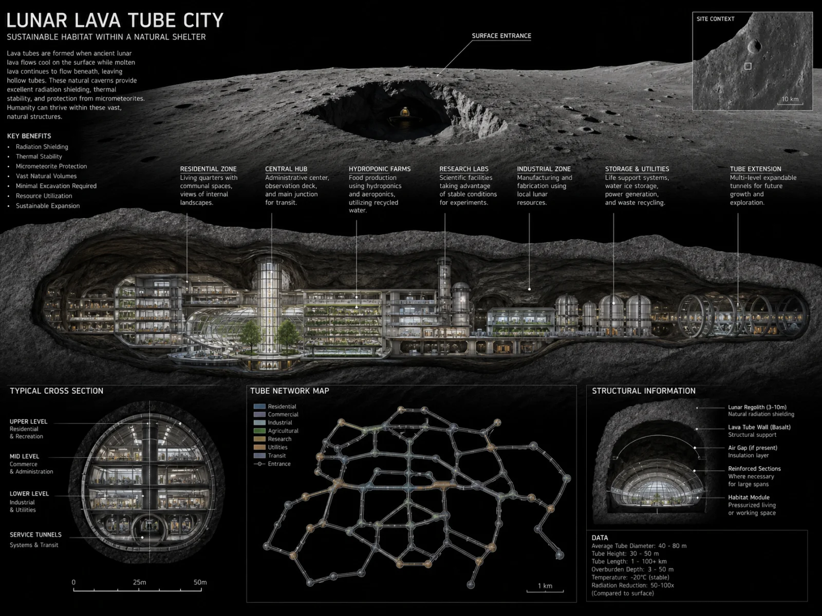
Controlled:

What to notice. The second earned dark, and the most factually bulletproof sheet in the set. Every callout is a real measured thing: skylight pits from tens of meters past a hundred, tube widths commonly 50 to 200 meters, the near-constant 17 to 20 Celsius of the subsurface, the minus 173 to plus 127 swing it escapes, with correct Fahrenheit conversions riding along. The survey furniture sells it, a named survey line in Mare Tranquillitatis, a datum, a scale bar, two-times vertical exaggeration declared, and the taped-in survey photo quiet quote in the corner. The amber city glow is the only warmth on the chalk-dust board, exactly as priced. One character glitch shipped in a caption, "shielded" rendered with a broken letter, the small-print tax again, logged and taught rather than re-rolled.
Swap ideas. An under-ice base on Europa, a city beneath a frozen ocean’s roof. A cloud city on Venus, where the air itself is the lifting gas. A lakeside station on Titan, the only other shoreline in the solar system. An asteroid-belt mining town, drawn like a company outpost.
Prompt 6: The Ocean Floor Express, 16:9
Default:
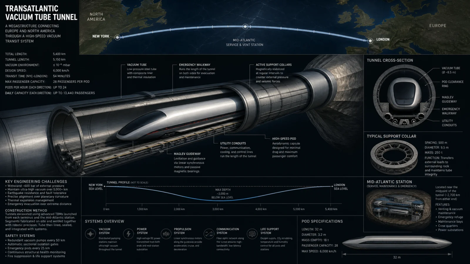
Controlled:
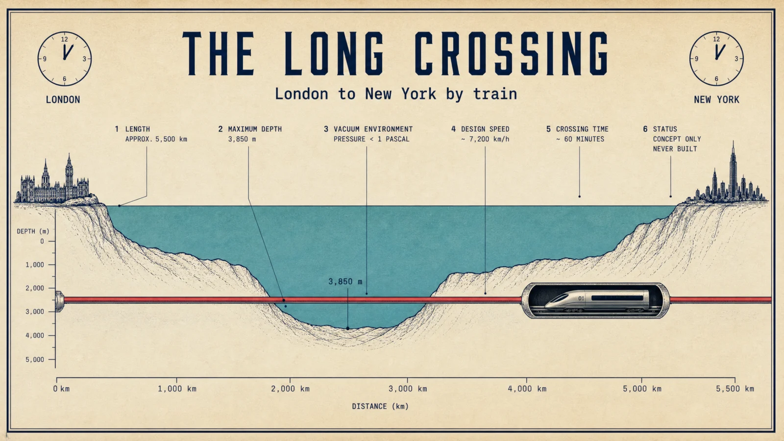
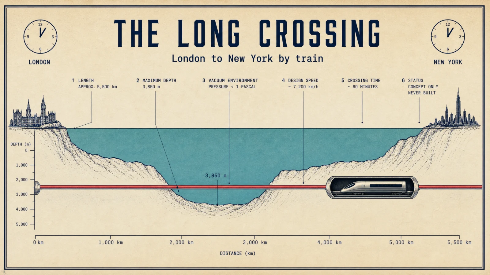
What to notice. The page hero, because no sheet states The Serious Dream better: an impossible train drawn as a sober profile chart, teal spent only on the ocean, oxide red spent only on the tube, and callout six reading STATUS: CONCEPT ONLY, NEVER BUILT, the honesty label printed right on the poster. The two clock faces at the ends show the same hour, the entire joke and promise of the concept in one quiet detail. The real crossing distance landed at about 5,500 kilometers and the about-an-hour claim rode in as pinned; the model added its own 7,200 kilometers per hour, which would beat an hour on flat math and reminds you that even good sheets deserve the two-minute audit. The photoreal capsule at the one break in the profile does what every hero window in this category does: it makes the paperwork feel inhabited.
Swap ideas. The gravity train, a straight tunnel through the planet where physics does the driving. A Bering Strait crossing, the bridge between hemispheres. A floating submerged bridge across Gibraltar, anchored to the seafloor by cables. A mid-Atlantic sea city, moored where the crossing needs a harbor.
The Method In One Box
Run the bare code first, always. On megastructures it will hand you cinema, glow, lens flare and a tiny silhouetted human. Study it, then take away the popcorn.
Keep the code as line 1. The word diagram is doing real work, it points the model at callouts and cutaways instead of pure spectacle.
Name the movement before any prompt. The Serious Dream decided every sheet would look like paperwork from a firm that means it, and that one sentence art-directed the whole set.
Ground first, never pure white or black. Dreams earn paper too: sage, oatmeal, terracotta, chart cream, and two darks bought with stated reasons, a starship’s night and the Moon’s interior.
Draw the structure, photograph its life. One real opening per sheet, the cutaway window, the woven cable, the lamplit street, and everything structural stays ink.
Carry only the real published figures of each concept, cap the callouts at six, and say concept, never built where it is true. Speculative subjects are where invented numbers breed.
Two typefaces, three sizes, small caps headers, labels in the margins with hairline leaders and terminal dots.
Print finish, stated ratio, same ratio in the settings, medium quality at 2K.
One retry per image, only on a checklist fail, fix the single cause.
Common Issues And Fixes
The render habit. Five of six defaults arrived as dark sci-fi dashboards. Fix: name a print tradition in THE ART DIRECTION and a paper ground in PALETTE LOCK, and the same subject comes back as a document. The one default that came back on paper by itself, the starship, shows the word "diagram" pulling its weight.
Invented numbers on speculative subjects. The confirmed disease of this category. A ring diameter echoing Earth’s with a shifted decimal, 250 generations squeezed into 2,500 years, 5,000 people fed from 1.6 hectares, a gravity formula worked incorrectly under its own printed equation. Fix: pin the real published figures in THE DATA CARRY, then audit every number the model volunteers on top, especially the precise-sounding ones.
The self-contradicting sheet. The ring default printed one diameter in its spec box and computed a different one in its own scale panel. Fix: when two numbers on a sheet describe the same thing, check them against each other before shipping; internal agreement is the cheapest fact-check you own.
True fact, wrong shelf. The elevator ribbon came labeled with a real fiber that suits lunar elevators and cannot hold an Earth ribbon. Fix: on concepts, verify materials and mechanisms the way you verify quotations, a plausible name is not a correct one.
House jargon read as English. Our design system’s "quiet quote" produced, alongside the ordered marginalia, a genuine Charles Dickens quotation, real and correctly attributed. Harmless here, instructive everywhere: the model reads your private vocabulary literally when it can. Name the exact object you want drawn.
Next Step
Run the space elevator pair first, the most vertical sheet in the vault teaches ratio discipline faster than any lecture. Then pick your own impossible thing, name the one real published figure it deserves, and draw it like the firm already ordered the steel. Post your favorite before and after in the community. Page 6 comes home to true stories: THE MISSION PROFILE CODE, mission profile of, where real journeys carry real numbers and the trajectory line is the hero.
Section 06
THE MISSION PROFILE CODE
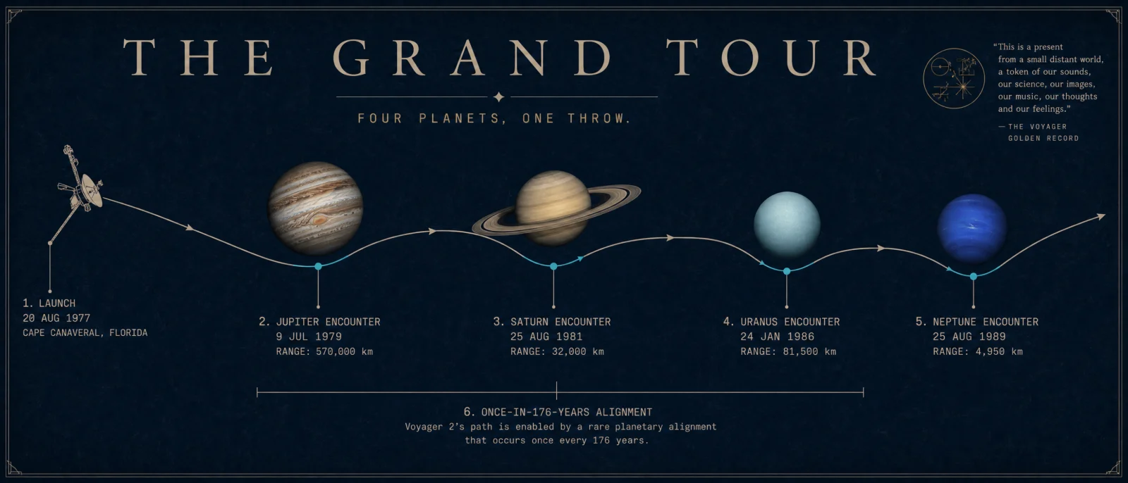
A whole voyage for free, drawn as one line. Then charted like the print on the mission control wall.
Type "mission profile of" and any journey, and the model gives you the diagram every space agency has drawn since the sixties: the trajectory line, the phases, the burns, the timeline underneath. This is the vault’s truest category. The other five explain objects, ideas and phenomena. This one tells stories that actually happened, with numbers that are matters of record, which raises the stakes twice. Real missions drag real insignia into the frame, and multi-stop journeys scramble their dates the way every lineup in this vault has tried to. The movement is Flight Plans: one journey per sheet, the trajectory is the hero, the craft appears real only at the moments that matter, and nothing wears a logo. The code brings the voyage. You bring the chart room.
What The Code Actually Is
"Mission profile of" points the model at the archive agencies built themselves: press-kit trajectory diagrams, museum wall panels, textbook orbit charts, anniversary posters. It is disciplined source material, drawn by people who cared, so the bare code starts closer to good than any other category in this vault. It also inherits the archive’s ownership marks. Real missions were flown by real agencies, and the default will happily print their logos, their patches and their typography, which a paid product cannot carry.
The tells of the default, from this run, and one prediction that failed in an interesting way. We braced for agency logos on every sheet and got none: six defaults, zero meatballs, zero mission patches. What the archive actually dragged in was subtler. The Apollo default planted a small national flag on its lunar surface, exactly as the archive remembers the scene, which the controlled sheets ban by design and this page notes honestly where shown. The Hohmann default turned out to be the most correct sheet any bare code produced in this entire vault, every orbital element textbook-true, because the textbook archive is disciplined. And the New Horizons default invented an entire mission event, an "Earth gravity assist" that never happened, dated the same day as the real Jupiter one. The mission archive’s failure mode is not decoration. It is confident false memory, stamped with a date.
The Control Layer
This set runs under one named movement: Flight Plans. Every sheet is one journey told cause to effect as a single drawn line, launch to ending, with the burns marked like decisions. The craft and the worlds turn real at the hinge moments. Everything else stays chart.
STYLE THE CODE protects the profile DNA, the trajectory line, the phase labels, the burns and the timeline, the whole journey readable in one look.
THE ART DIRECTION rotates six named traditions across the set: an expedition field notebook for Apollo’s figure eight, a museum wall diagram for the grand tour, Japanese manual precision for the Sun diver’s spiral, a Swiss grid for the textbook ellipse, two-ink risograph for the nine-year line, and seventies airbrush for the night the orbit changed. One composition device and one quiet quote each.
PALETTE LOCK holds the ground law. This set runs aged chart cream, deep midnight navy (dark because the grand tour is a night voyage past four giants), ochre mustard, duck-egg blue, muted sage and warm charcoal (dark because the impact happened in deep night and the plume is the only light). Two darks in six, both with their reasons stated inside the prompt.
THE OBJECT is this category’s hero block. The trajectory stays drawn ink, and reality enters at the hinge moments: a photoreal command module after launch and a capsule under parachutes at the end, four photoreal giants standing along one bone-ink path, a boiling solar limb with a glowing heat shield falling past it, a photoreal Earth and Mars pinned to their drawn orbits, Pluto’s pale heart at the end of a nine-year line, a rubble asteroid caught in the flash of the moment we moved it.
THE DATA CARRY keeps the honesty: every figure is the real mission figure, unchanged, a callout cap of six to seven, nothing invented for decoration, no sources box. On this category the carry doubles as the safety layer, earned across this whole vault: no agency logos, no mission patches, no flags, no lettering on any craft, and no human faces. The missions are historical fact and appear as educational subjects only.
TYPE SYSTEM, LABEL DISCIPLINE and FINISH hold the vault law: two typefaces, three sizes, small-caps headers, hairline leaders with terminal dots in the margins, and a named print process.
Prompt 1: The Free-Return Eight, 16:9
Default:
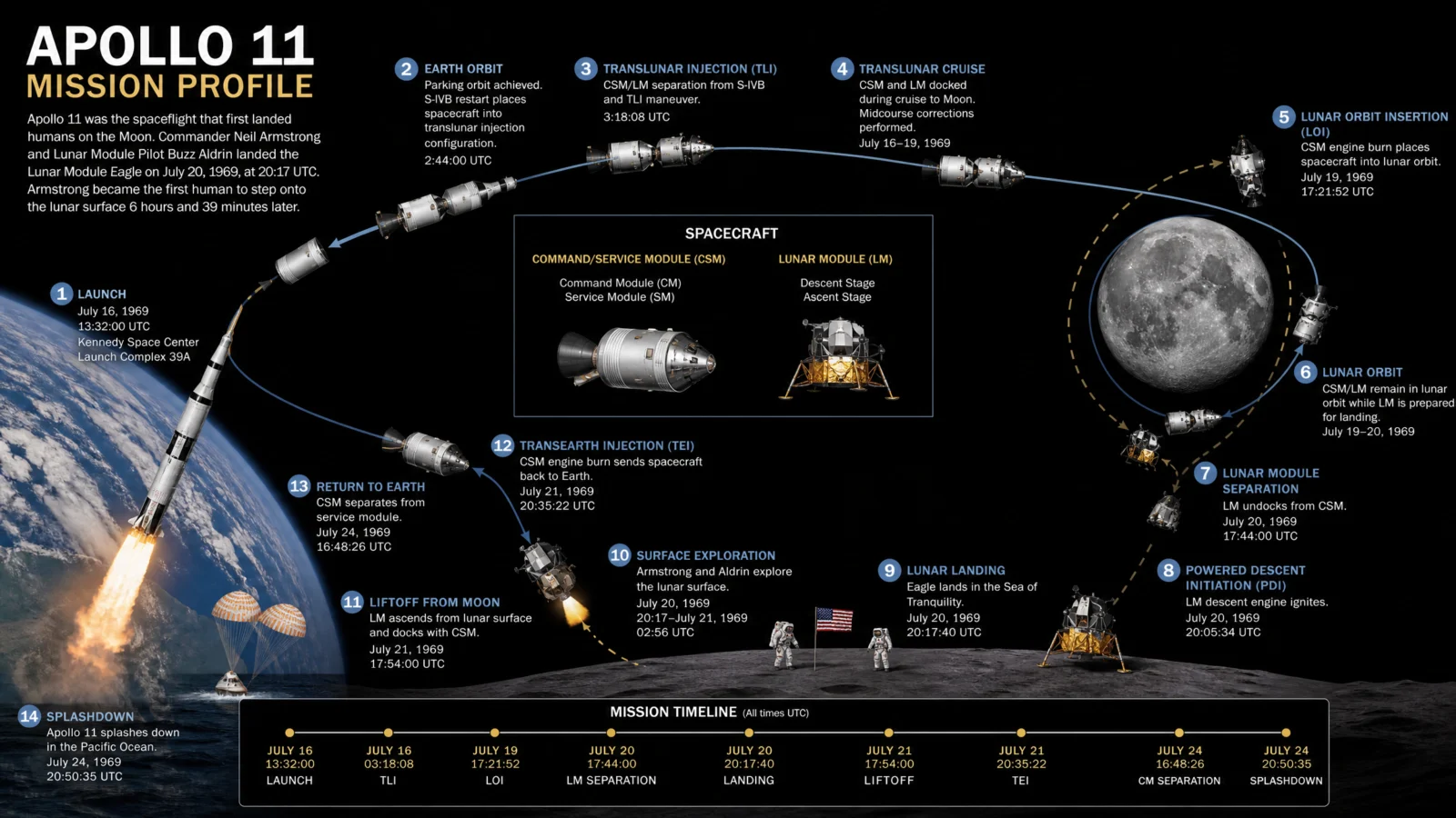
shown as generated; note below on the flag the archive brings with it
Controlled:
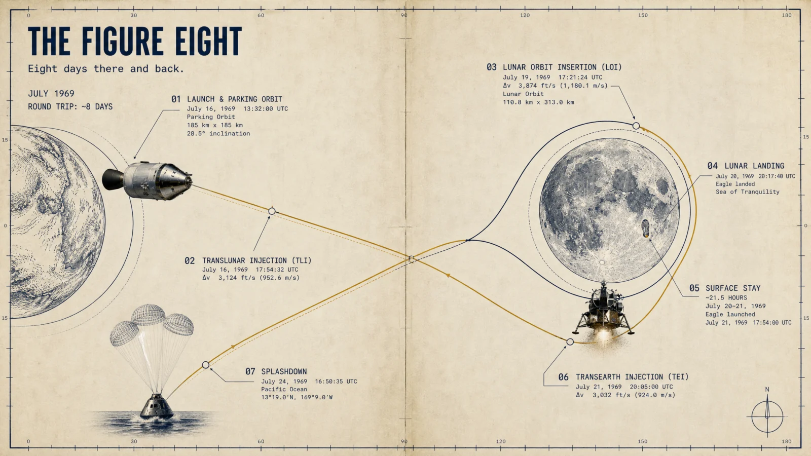
What to notice. The figure-eight rules the sheet exactly as drawn in 1969, and the three photoreal hinges, stack, lander, splashdown capsule, arrived unmarked as ordered. The bootprint sits at the Sea of Tranquility. Now the numbers, because this sheet teaches the vault’s deepest data lesson. The facts nobody would think to fake are perfect: splashdown at 16:50:35 UTC at 13 degrees 19 minutes north, 169 degrees 9 minutes west, the real recovery coordinates. The pinned figures held, July 1969, eight days, 21.5 hours on the surface. But the decorative delta-v values are wrong, and the TLI timestamp reads 17:54, which is the Moon liftoff time wearing the wrong label, the lineup scramble reborn as a time scramble. The default, meanwhile, printed the flag the archive remembers, which a sellable product strips and this caption explains. Pin what must be true, delete what you cannot verify, and treat every unpinned number as decoration until proven otherwise.
Swap ideas. Apollo 13’s emergency loop home, the profile that saved three lives. The Artemis path back, the same Moon by a stranger road. A Saturn V staging timeline, three rockets stacked into one journey. The lunar rover’s traverse, a mission profile you could walk.
Prompt 2: The Four-Planet Throw, 21:9
Default:

Controlled:
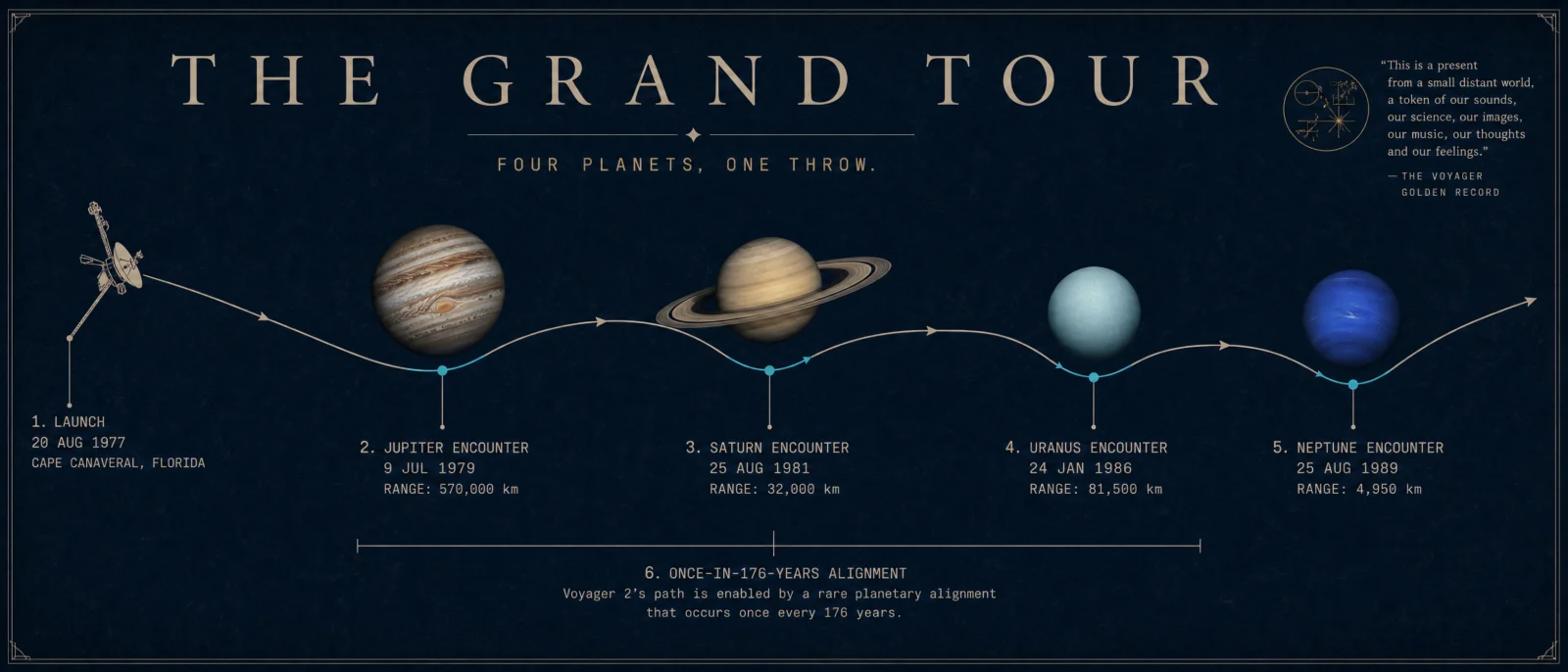
What to notice. The page hero, and the roster law’s graduation ceremony. Four photoreal giants stand along one bone-ink line, and every pinned date sits beside its own world: Jupiter 1979, Saturn 1981, Uranus 1986, Neptune 1989, with the 176-year alignment closing the sheet. The pin held on the vault’s hardest lineup. Then look at the one number we did not pin: Saturn’s flyby range prints as 32,000 kilometers, a third of the real distance, while the three pinned-adjacent ranges came back correct. Same sheet, same model, one unpinned cell, one casualty. And the quiet quote outdid itself again: beside the drawn golden disc the model printed the record’s actual greeting, "This is a present from a small distant world," word for word and correctly attributed. Museum wall achieved.
Swap ideas. Cassini’s grand finale, the dives between Saturn and its rings. Rosetta’s decade-long chase to catch a comet. Galileo’s tour of the Jovian moons, one giant, many worlds. Pioneer 10 leaving the planets behind, the first goodbye.
Prompt 3: The Shrinking Spiral, 4:3
Default:
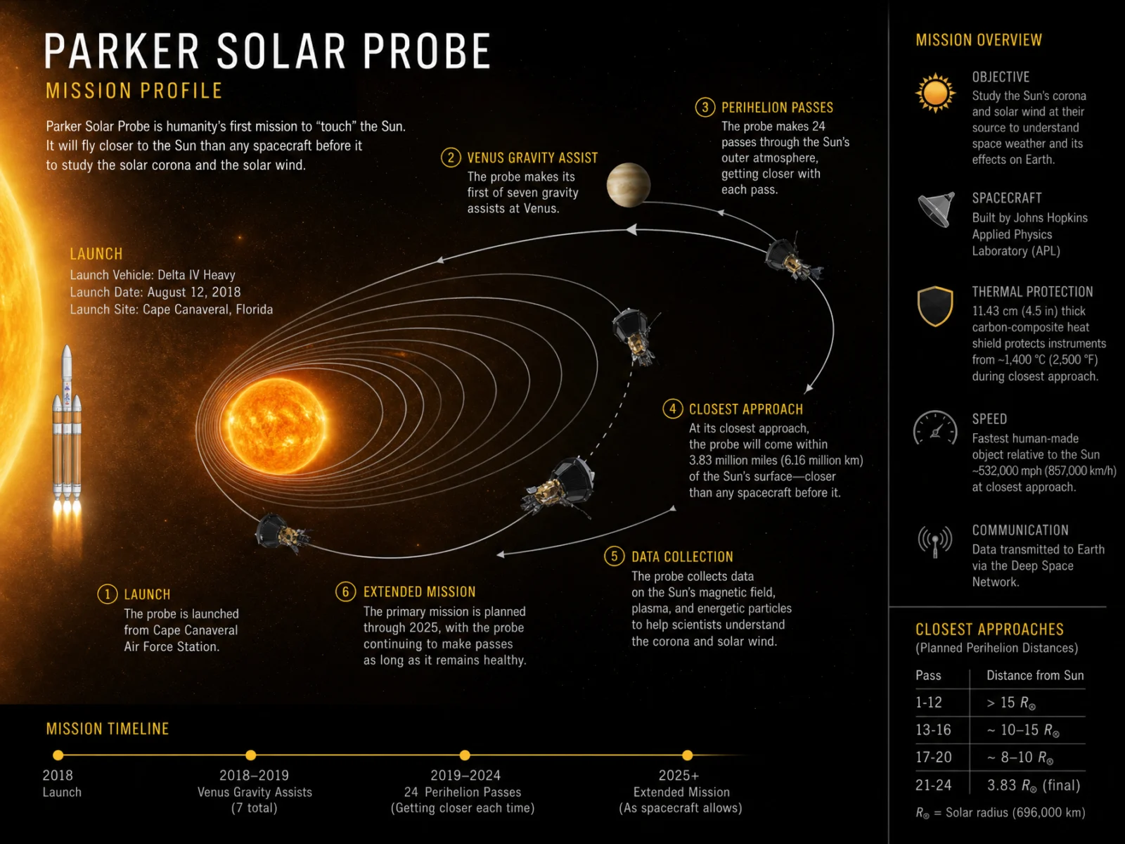
Controlled:

What to notice. The boiling photoreal limb owns the right third of the sheet, the petal orbits tighten toward it in patient umber ink, and the shield note arrived as a checked box reading "faces the Sun, always." The pinned figures held exactly: launch on 12 August 2018, seven Venus flybys, 6.2 million kilometers, 690,000 kilometers per hour, fastest thing we ever built. Then study the flyby date table, because we pinned the COUNT of seven but not the dates, and the model volunteered all seven dates anyway: the first, third and launch-adjacent ones are real, and four drifted by months or years. Beside the Voyager sheet, where every date was pinned and every date survived, this is the cleanest controlled experiment the vault ever ran on itself. The pin is not decoration. The pin is the data’s seatbelt.
Swap ideas. Solar Orbiter’s climb to see the Sun’s poles. Messenger’s long braking road to Mercury, six years to slow down. BepiColombo’s flyby chain, borrowing gravity nine times. Ulysses over the Sun’s poles, the mission that left the flat solar system.
Prompt 4: The Textbook Ellipse, 3:2
Default:

Controlled:
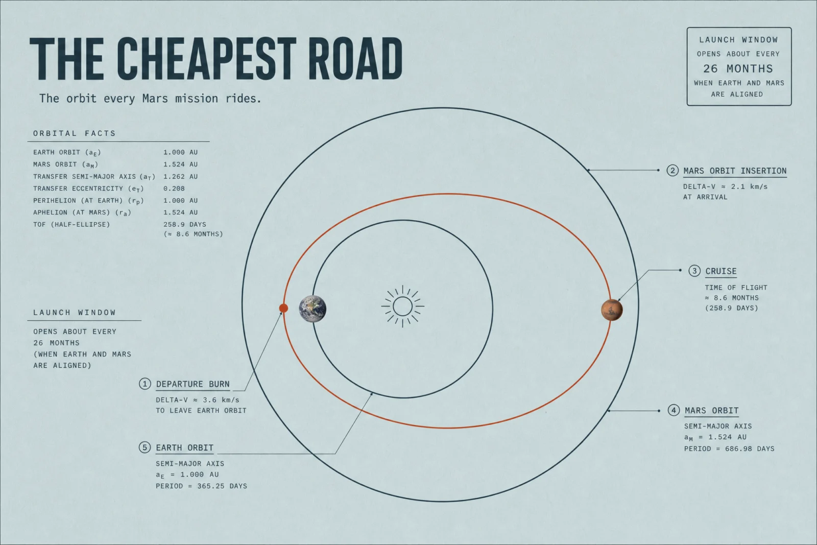
What to notice. The geometry pin worked where the comet sheet’s did not: the ember ellipse kisses Earth’s orbit at departure and Mars’s orbit at arrival, tangent at both ends, planets placed exactly opposite as a real transfer demands. Time of flight 258.9 days, window every 26 months, both true. The burns print as 3.6 and 2.1 kilometers per second, and here is the subtle lesson: those are the practical mission numbers, the burn out of Earth parking orbit and the capture at Mars, while the bare default printed the textbook heliocentric pair, 2.94 and 2.65. Both sheets are right inside their own accounting. When two sources disagree about a number, check whether they are answering the same question before calling either wrong. One trim for your own version: the launch window printed twice, once as the corner stamp and once in the margin, a pinned fact arriving with an echo.
Swap ideas. The gravity assist, drawn as honest theft of a planet’s momentum. The bi-elliptic transfer, when the long way around is cheaper. Aerobraking, using an atmosphere as the brake pad. The interplanetary superhighway, the low-energy paths between worlds.
Prompt 5: The Nine-Year Line, 16:9
Default:
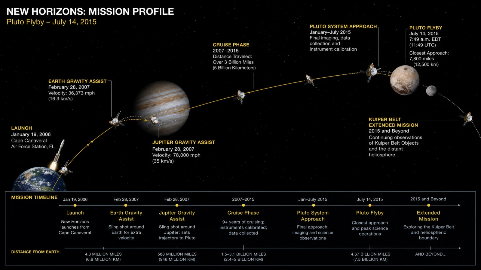
shown as generated; find its invented mission event before reading on
Controlled:

What to notice. Nine years of nothing, then everything: the cruise line runs thin across four fifths of the sheet and the gold blooms only at Pluto, whose pale heart carries the accent exactly as licensed. Every pinned figure landed, the 19:00 UTC launch, nine and a half years, 12,500 kilometers, 14 kilometers per second, the four and a half hour signal. The orbit ticks along the cruise turned out real too, Jupiter in 2007, Saturn’s orbit crossed in June 2008, Uranus’s in March 2011, actual crossing dates. Now hold this against its own default, which invented an Earth gravity assist that never happened and dated it identically to the real Jupiter one. Same subject, same model, same afternoon. The difference is the carry: real figures from your own knowledge, unchanged, nothing invented, and the invented event never got a visa.
Swap ideas. Dawn’s double tour, the only craft to orbit two worlds. Lucy threading the Trojan asteroids, a decade of stepping stones. OSIRIS-REx’s grab and go, the six-second touchdown. The Arrokoth extension, the farthest world we ever visited.
Prompt 6: The Thirty-Two Minutes, 4:3
Default:

Controlled:
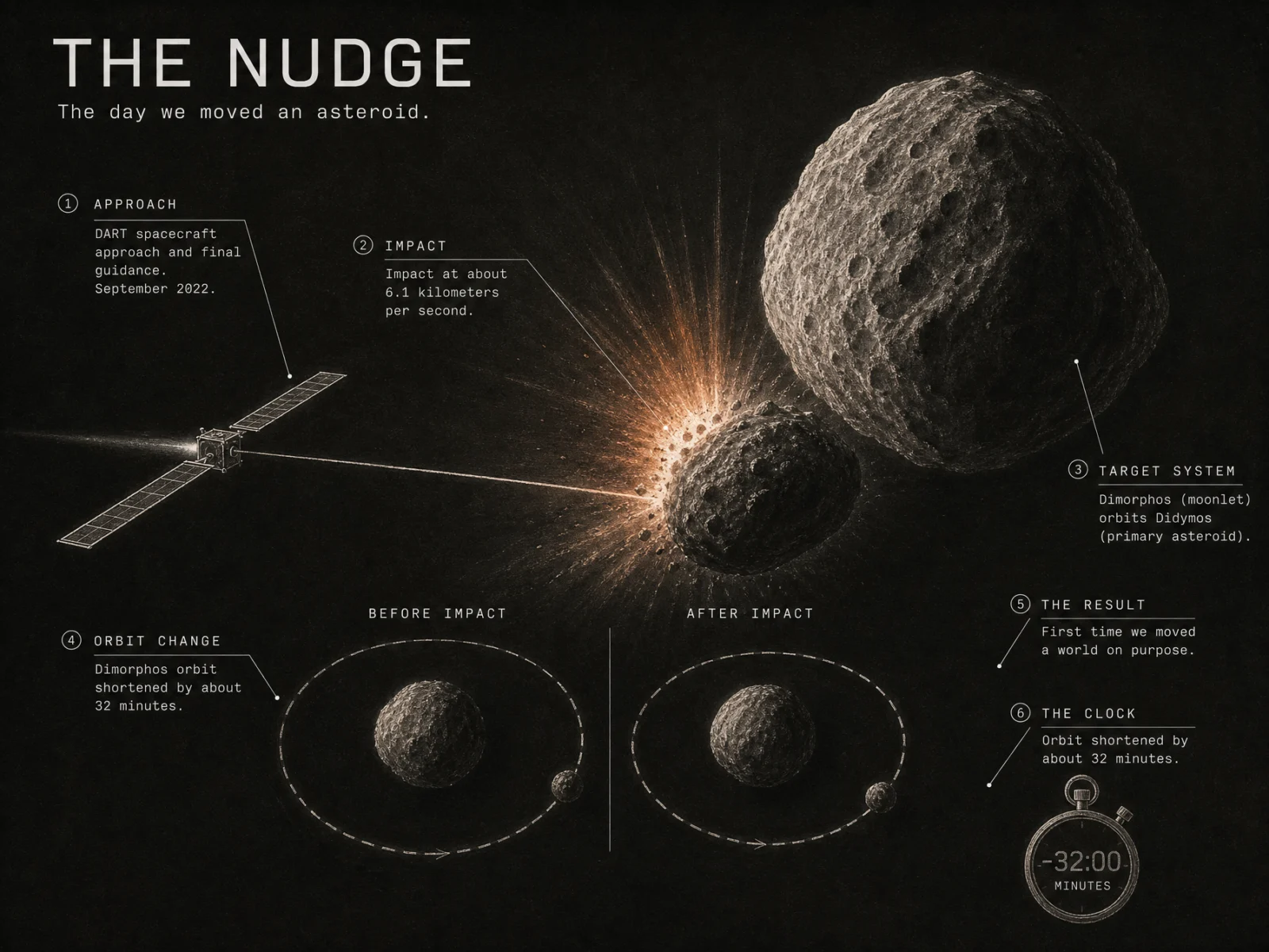
What to notice. The vault closes on its second earned dark, and its darkest: chalk on a board that borders on night, defensible only because the ember flash is meant to be the single light in the frame. Dimorphos and Didymos sit on the correct bodies, the impact prints at 6.1 kilometers per second, the before and after orbits read side by side, and the stopwatch quiet quote arrived showing minus 32 minutes on its face, the whole mission’s result drawn as a clock. Two notes for your own take. The 32-minute figure printed twice, in the orbit-change callout and the clock callout, the pinned-fact echo again. And its default deserves respect with an asterisk: real spacecraft specs, real target diameters, then two invented instruments, one of them borrowed by name from New Horizons. Even when the archive knows the mission, it swaps parts between ships. Pin the payload if the payload matters.
Swap ideas. Deep Impact, the mission that hit a comet to read its insides. Hera, the follow-up that surveys what DART changed. The asteroid watch, near-Earth surveys drawn as one sky map. A kinetic impactor rehearsal at planetary scale, the drill for the day it matters.
The Method In One Box
Run the bare code first, always. On real missions the default starts closer to good than any category in this vault, and it will still hand you insignia you cannot ship.
Keep the code as line 1. The profile instinct, trajectory, phases, burns, timeline, is the engine and it is strong.
Name the movement before any prompt. Flight Plans made the trajectory the hero of all six sheets, and every other decision followed.
Ground first, never pure white or black. History earns paper: chart cream, mustard, duck-egg, sage, and two darks bought with reasons, a night voyage and an impact plume.
Draw the journey, photograph the hinges. The line stays ink, reality enters at launch, encounter and ending.
Carry only the real mission record, cap the callouts, and pin multi-stop rosters date by date. Four planets with four dates is a lineup, and lineups scramble when unpinned.
Ban the archive’s ownership marks in every controlled prompt: no agency logos, no mission patches, no flags, no lettering on craft, no human faces.
Two typefaces, three sizes, small caps headers, labels in the margins with hairline leaders and terminal dots.
Print finish, stated ratio, same ratio in the settings, medium quality at 2K.
One retry per image, only on a checklist fail, fix the single cause.
Common Issues And Fixes
The insignia that actually came. No agency logos appeared on any of the twelve sheets, but the Apollo default planted the flag the archive remembers on its lunar surface. Fix: the controlled prompts ban flags, patches, logos and lettering inside THE OBJECT, and any shown default carries an honest caption instead of silent cropping.
Unpinned dates decay, pinned dates survive. Voyager’s four pinned encounter years all landed true. Parker’s seven volunteered flyby dates scrambled four of seven. Apollo’s decorative delta-v numbers went wrong while its pinned durations held. Fix: pin every date and figure that matters inside THE DATA CARRY, and delete or verify everything the model offers beyond the pin.
Confident false memory. The New Horizons default invented an Earth gravity assist, complete with a date, and the DART default staffed the spacecraft with an instrument borrowed by name from another mission. Fix: the carry’s hard line, nothing invented, real figures from your own knowledge unchanged, and a human pass over every mission event before publishing.
The pinned fact echoes. The Hohmann sheet printed its launch window twice; the DART sheet printed its 32 minutes twice. A pinned fact sometimes arrives with a stutter. Fix: harmless to ship, better to name one home for each fact, in the callout or in the stamp, not both.
Next Step
Run the Hohmann pair first, two circles and an ellipse teach the whole category’s grammar in one sheet. Then chart a journey you love, pin its dates like a roster, and let one drawn line carry the story. Post your favorite before and after in the community. This page closes the six codes of Vol.21: flow, scale, theory, space, megastructure, mission. The wrap post collects the vault’s strongest sheets, the full method box and the complete production log, and the next vault is already on the drawing board.